
Chapter 13: Improving App Performance
Contents
Chapter 13: Improving App Performance
What you will learn
As dashboards are designed for data analysis and visualisations, at some point you might run into efficiency constraints when the amount of data you are working with becomes too big. To circumvent possible performance issues, this chapter will give you some insights on ways to improve your app performance. You’ll learn about the built-in Dash Developer Tools, how to plot massive amounts of data with higher performing plotly graphs, and how to use caching to improve the performance of your app.
Learning Intentions
Dash Developer Tools
Plotly Graphs for Big Data
Caching
13.1 Introduction
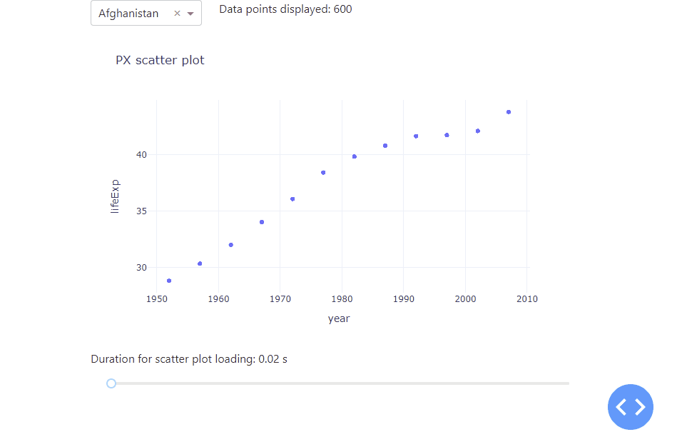
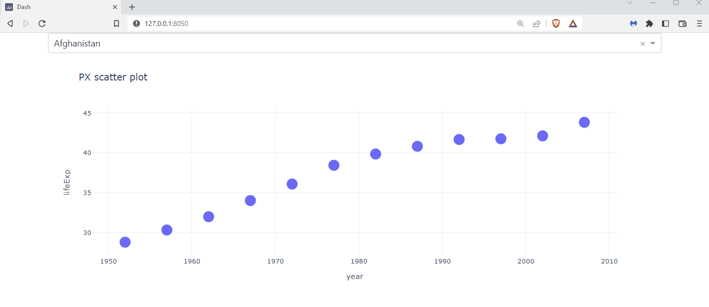
Let’s kick off with a simple app with a scatter plot that display the life expectation over the years for a selected country. To better understand how a growing data set affects the app performance, we duplicated the underlying data set by a value of our choice, using a range slider. As the underlying data set grows, the data points in the scatter plot will be resized as well. Lastly, we used the datetime package to tell us the time it takes the app to load. All in all, we receive the following app:
See the code
# Import packages
from dash import Dash, dcc, Input, Output
import dash_bootstrap_components as dbc
from datetime import datetime
import numpy as np
import pandas as pd
import plotly.express as px

# Setup data
df = px.data.gapminder()[['country', 'year', 'lifeExp']]
dropdown_list = df['country'].unique()

# Initialise the App
app = Dash(__name__, external_stylesheets=[dbc.themes.BOOTSTRAP])

# Create app components
markdown = dcc.Markdown(id='our-markdown')
dropdown = dcc.Dropdown(id='our-dropdown', options=dropdown_list, value=dropdown_list[0])
markdown_scatter = dcc.Markdown(id='markdown-scatter')
slider = dcc.Slider(id='our-slider', min=0, max=8500, marks=None, value=0)

# App Layout
app.layout = dbc.Container(
    [
        dbc.Row([dbc.Col(dropdown, width=3), dbc.Col(markdown, width=9)]),
        dbc.Row([dbc.Col(dcc.Graph(id='our-figure'))]),
        dbc.Row([dbc.Col(markdown_scatter)]),
        dbc.Row(dbc.Col(slider)),
    ]
)


# Configure callbacks
@app.callback(
    Output(component_id='our-markdown', component_property='children'),
    Input(component_id='our-dropdown', component_property='value'),
    Input(component_id='our-slider', component_property='value'),
)
def update_markdown(value_dropdown, value_slider):
    df_sub = df[df['country'].isin([value_dropdown])]
    title = 'Data points displayed: {:,}'.format(len(df_sub.index) * value_slider)
    return title


@app.callback(
    Output(component_id='our-figure', component_property='figure'),
    Output(component_id='markdown-scatter', component_property='children'),
    Input(component_id='our-dropdown', component_property='value'),
    Input(component_id='our-slider', component_property='value'),
)
def update_graph(value_dropdown, value_slider):
    df_sub = df[df['country'].isin([value_dropdown])]
    df_new = pd.DataFrame(np.repeat(df_sub.to_numpy(), value_slider, axis=0), columns=df_sub.columns)
    start_time = datetime.now()
    fig = px.scatter(
        df_new,
        x='year',
        y='lifeExp',
        title='PX scatter plot',
        template='plotly_white',
    )
    fig.update_traces(marker=dict(size=5 + (value_slider / 10000) * 25))
    end_time = datetime.now()
    subtitle = 'Duration for scatter plot loading: {} s'.format(round((end_time - start_time).total_seconds(), 2))
    return fig, subtitle


# Run the App
if __name__ == '__main__':
    app.run_server(debug=True)
Notice how adjusting the range slider to the right increases the data set used, which increases the amount of time it takes the app to refresh and plot the data. As you can see, there are huge performance differences between 600 data points and 100 thousand data points used. To handle even much larger data sets, you will learn the different graphs that you can use as well as how to use stored data to improve app performance. Before that, Dash itself comes with a really handy built-in functionality to better analyse and understand the performance of your app – the Dash Developer Tools.
13.2 Dash Developer Tools
The Dash Developer Tools is a set of tools to make debugging and developing Dash apps more productive and pleasant. These tools are enabled when developing your Dash app and are not intended when deploying your application to production. In order to make use of the Dash Developer Tools you must run your app with debug=True. When you do this, your app will always display a blue circular button in the bottom right corner of your app with angle brackets in it. This button will grant you access to error messages and information about your callbacks.
Dash Developer Tools
For an overview of the other tools within the Developer Tools, look at the official documentation.
Let’s look at the Callback Graph. The Dash Developer Tools displays a visual representation of your callbacks: which order they are fired in, how long they take to fully execute, and what data is passed back and forth between the web browser and the server. To open up the Callback Graph, click on the bottom right circular blue button and then on the most left button named “callbacks”. You will get the following view:
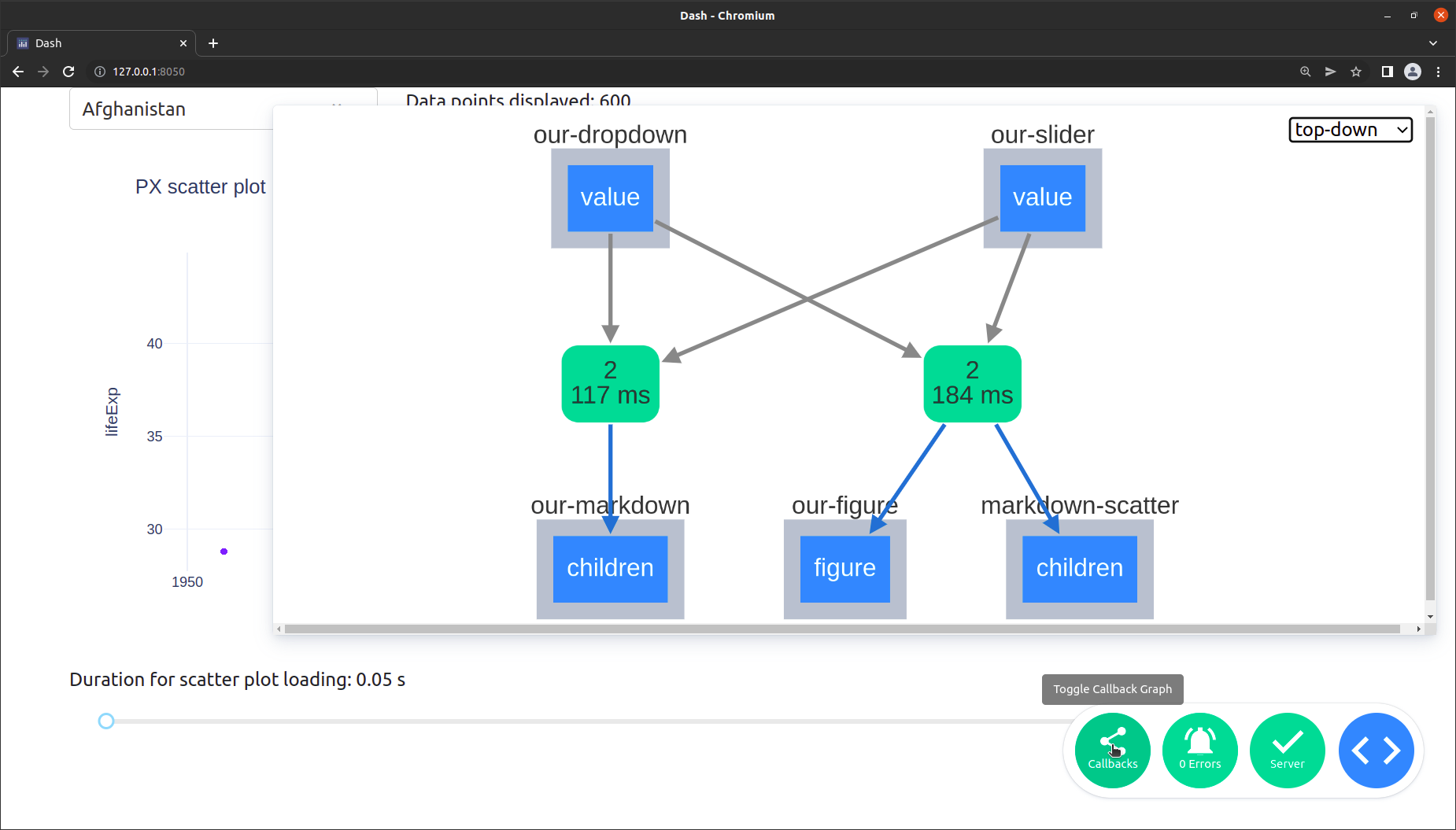
Let’s go through the different items in more detail:
The rounded green boxes with the numbers in them, which show up in the middle:
The top number represents the number of times the function has been called.
The bottom number represents how long the request took. This includes the network time (sending the data from the browser client to the backend and back) and the compute time (the total time minus the network time or how long the function spent in Python).
You are also able to click on a green box to see the detailed information about the callback which would open up in the bottom left of the view. This includes:
typeWhether the callback was a clientside callback or a serverside callback.call countThe number of times the callback was called during your session.statusWhether the callback was successful or not.time (avg milliseconds)How long the request took. This is the same as the summary on the green box and is basically split up into the componentstotal,computeandnetwork.data transfer (avg bytes)outputsA JSON representation of the data that was returned from the callback.inputsA JSON representation of the data that was passed to your callback function as Input.stateA JSON representation of the data that was passed to your callback function as State.
The blue boxes with a light grey frame around them, which are positioned at the top and bottom, represent the input and output properties respectively. Click on the box to see a JSON representation of their current values.
The dashed arrows (not visible in the screenshot) would represent
Stateelements instead ofInput.The dropdown in the top right corner enables you to switch layouts.
Now, that you know how to check for the performance of your app, let us learn about different higher performing graphs and how to incorporate them into you app.
13.3 Plotly Graphs for Big Data
So far, we have used the plotly.express library to implement our graphs. This is a very easy and convenient way to do so. However, most plotly charts are rendered with SVG (Scalable Vector Graphics). This provides crisp rendering, publication-quality image export, as SVG images can be scaled in size without loss of quality, and wide browser support. Unfortunately, rendering graphics in SVG can be slow for larger datasets as we have noticed in the first section of this chapter. To overcome this limitation, let’s explore the three common methods that will speed up your app when working with larger data sets.
13.3.1 ScatterGL
First, let us have a look at the ScatterGL plot which is a WebGL implementation of the scatter chart type. In addition to Plotly charts rendered with SVG, Plotly has WebGL (Web Graphics Library) alternatives to some chart types. WebGL uses the GPU to render graphics which make them higher performing. The ScatterGL plot is the equivalent to the scatter plot but it is of WebGL type. To use it, you are required to import the plotly.graph_objects package.
ScatterGL
See the official documentation on how to implement the ScatterGL plot.
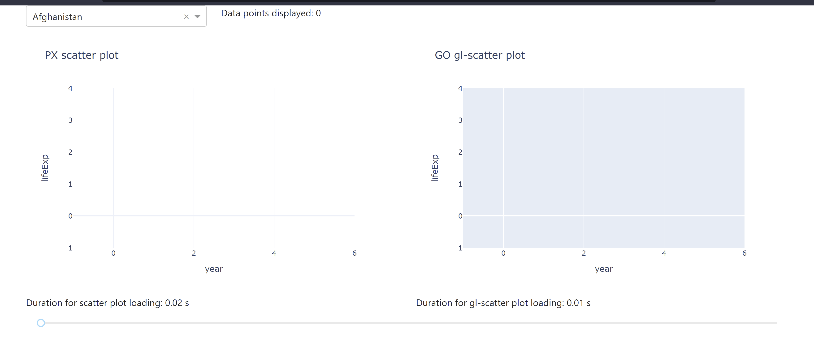
The following app lets you compare the different durations for data loading when using a ScatterGL plot alongside a regular Scatter plot. You see how the use of a ScatterGL could improve the app performance the larger the data set is.
See the code
# Import packages
from dash import Dash, dcc, Input, Output
import dash_bootstrap_components as dbc
from datetime import datetime
import numpy as np
import pandas as pd
import plotly.express as px
import plotly.graph_objects as go

# Setup data
df = px.data.gapminder()[['country', 'year', 'lifeExp']]
dropdown_list = df['country'].unique()

# Initialise the App
app = Dash(__name__, external_stylesheets=[dbc.themes.BOOTSTRAP])

# Create app components
markdown = dcc.Markdown(id='our-markdown')
dropdown = dcc.Dropdown(id='our-dropdown', options=dropdown_list, value=dropdown_list[0])
markdown_scatter = dcc.Markdown(id='markdown-scatter')
markdown_gl = dcc.Markdown(id='markdown-gl')
slider = dcc.Slider(id='our-slider', min=0, max=50000, marks=None, value=0)

# App Layout
app.layout = dbc.Container(
    [
        dbc.Row([dbc.Col(dropdown, width=3), dbc.Col(markdown, width=9)]),
        dbc.Row([dbc.Col(dcc.Graph(id='our-figure')), dbc.Col(dcc.Graph(id='our-gl-figure'))]),
        dbc.Row([dbc.Col(markdown_scatter), dbc.Col(markdown_gl)]),
        dbc.Row(dbc.Col(slider)),
    ]
)


# Configure callbacks
@app.callback(
    Output(component_id='our-markdown', component_property='children'),
    Input(component_id='our-dropdown', component_property='value'),
    Input(component_id='our-slider', component_property='value'),
)
def update_markdown(value_dropdown, value_slider):
    df_sub = df[df['country'].isin([value_dropdown])]
    title = 'Data points displayed: {:,}'.format(len(df_sub.index) * value_slider)
    return title


@app.callback(
    Output(component_id='our-figure', component_property='figure'),
    Output(component_id='markdown-scatter', component_property='children'),
    Input(component_id='our-dropdown', component_property='value'),
    Input(component_id='our-slider', component_property='value'),
)
def update_graph(value_dropdown, value_slider):
    df_sub = df[df['country'].isin([value_dropdown])]
    df_new = pd.DataFrame(np.repeat(df_sub.to_numpy(), value_slider, axis=0), columns=df_sub.columns)
    start_time = datetime.now()
    fig = px.scatter(
        df_new,
        x='year',
        y='lifeExp',
        title='PX scatter plot',
        template='plotly_white',
    )
    fig.update_traces(marker=dict(size=5 + (value_slider / 30000) * 25))
    end_time = datetime.now()
    subtitle = 'Duration for scatter plot loading: {} s'.format(round((end_time - start_time).total_seconds(), 2))
    return fig, subtitle


@app.callback(
    Output(component_id='our-gl-figure', component_property='figure'),
    Output(component_id='markdown-gl', component_property='children'),
    Input(component_id='our-dropdown', component_property='value'),
    Input(component_id='our-slider', component_property='value'),
)
def update_graph(value_dropdown, value_slider):
    df_sub = df[df['country'].isin([value_dropdown])]
    df_new = pd.DataFrame(np.repeat(df_sub.to_numpy(), value_slider, axis=0), columns=df_sub.columns)
    start_time = datetime.now()
    fig = go.Figure(data=go.Scattergl(
        x=df_new['year'],
        y=df_new['lifeExp'],
        mode='markers',
        marker=dict(colorscale='Viridis', size=5 + (value_slider / 30000) * 25),
    ))
    fig.update_layout(
        title='GO gl-scatter plot',
        xaxis_title='year',
        yaxis_title='lifeExp',
    )
    end_time = datetime.now()
    subtitle = 'Duration for gl-scatter plot loading: {} s'.format(round((end_time - start_time).total_seconds(), 2))
    return fig, subtitle


# Run the App
if __name__ == '__main__':
    app.run_server()
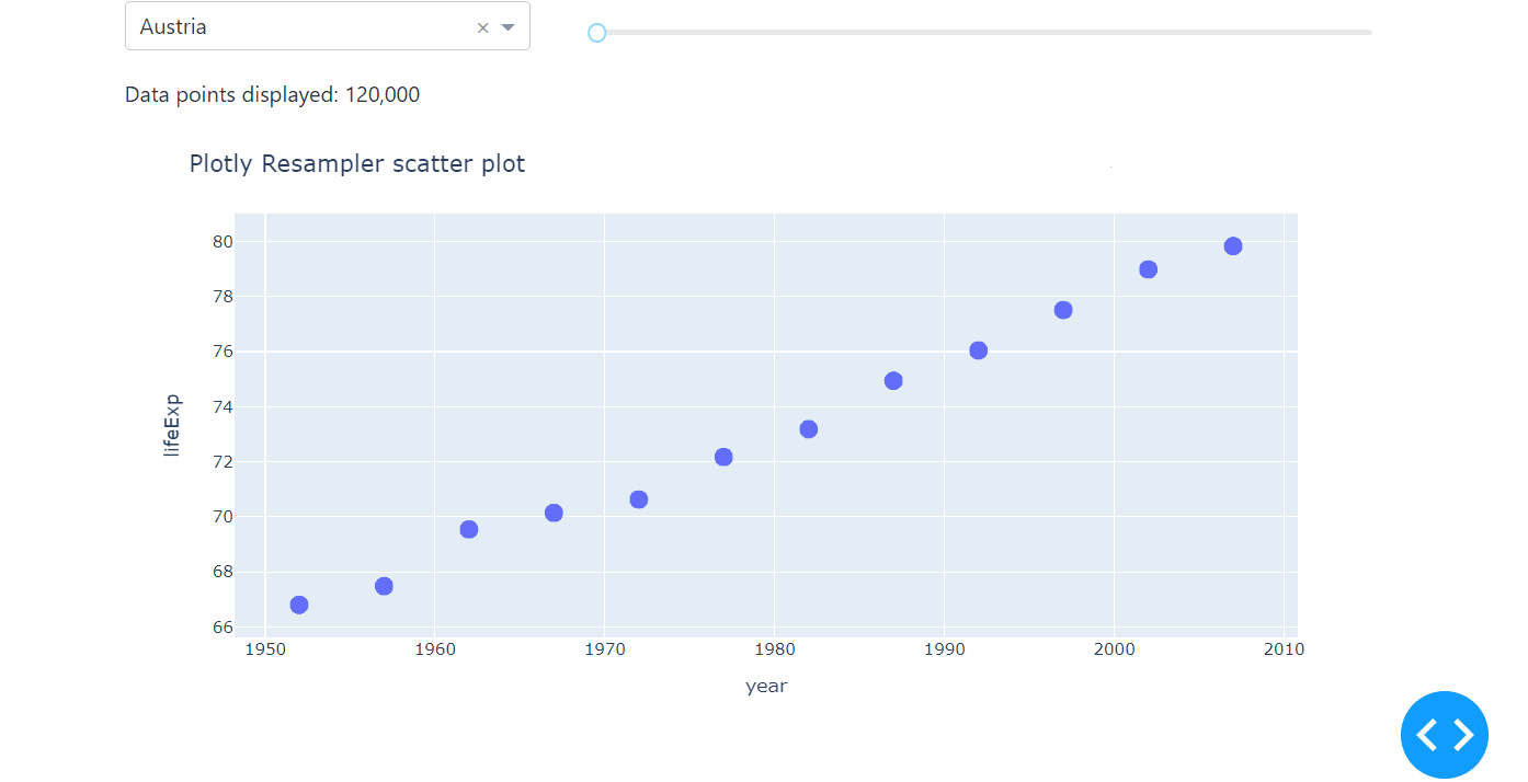
13.3.2 Plotly Resampler
Even though the ScatterGL outperforms the px scatter plot, it slows down when using very large data sets and might not be as fast as you would like it to be when interacting with the plot, for example, zooming in. That’s where the plotly_resampler package comes in very handy. This package speeds up the figure by down-sampling (aggregating) the data respective to the view and then plotting the aggregated points. When you interact with the plot (panning, zooming, etc.), callbacks are used to aggregate data and update the figure.
Plotly Resampler
This is a third-party, community, library, not officially maintained by Plotly. See the documentation on Github for more about the Plotly Resampler package. To work with this package, you would need to run pip install plotly-resampler as well as pip install ipywidgets.
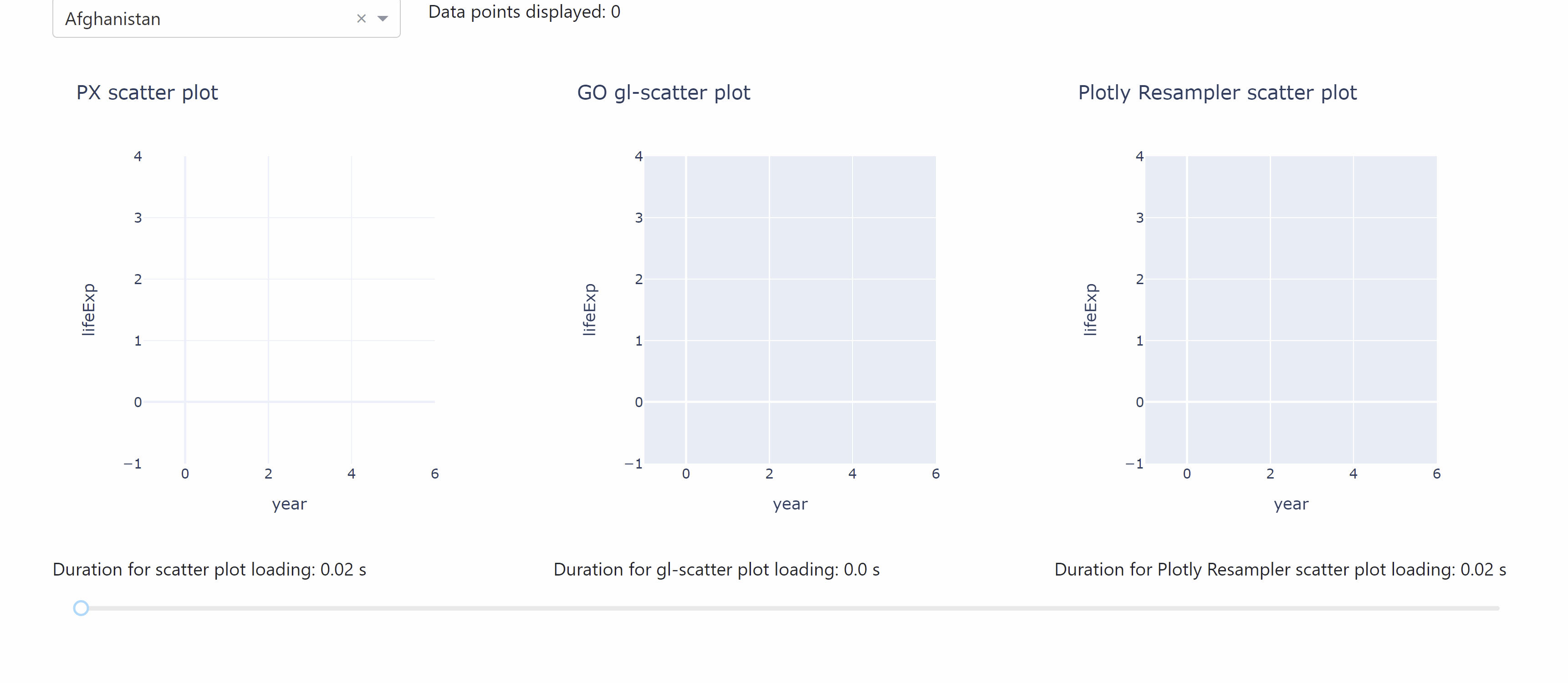
The following app lets you compare the different durations for data loading when working with the plotly resampler.
See the code
# Import packages
from dash import Dash, dcc, Input, Output
import dash_bootstrap_components as dbc
from datetime import datetime
import numpy as np
import pandas as pd
import plotly.express as px
import plotly.graph_objects as go
from plotly_resampler import FigureResampler

# Setup data
df = px.data.gapminder()[['country', 'year', 'lifeExp']]
dropdown_list = df['country'].unique()

# Initialise the App
app = Dash(__name__, external_stylesheets=[dbc.themes.BOOTSTRAP])

# Create app components
markdown = dcc.Markdown(id='our-markdown')
dropdown = dcc.Dropdown(id='our-dropdown', options=dropdown_list, value=dropdown_list[0])
markdown_scatter = dcc.Markdown(id='markdown-scatter')
markdown_gl = dcc.Markdown(id='markdown-gl')
markdown_resampler = dcc.Markdown(id='markdown-resample')
slider = dcc.Slider(id='our-slider', min=0, max=50000, marks=None, value=0)

# App Layout
app.layout = dbc.Container(
    [
        dbc.Row([dbc.Col(dropdown, width=3), dbc.Col(markdown, width=9)]),
        dbc.Row([dbc.Col(dcc.Graph(id='our-figure')),
                 dbc.Col(dcc.Graph(id='our-gl-figure')),
                 dbc.Col(dcc.Graph(id='our-resample-figure'))]),
        dbc.Row([dbc.Col(markdown_scatter),
                 dbc.Col(markdown_gl),
                 dbc.Col(markdown_resampler)]),
        dbc.Row(dbc.Col(slider)),
    ]
)


# Configure callbacks
@app.callback(
    Output(component_id='our-markdown', component_property='children'),
    Input(component_id='our-dropdown', component_property='value'),
    Input(component_id='our-slider', component_property='value'),
)
def update_markdown(value_dropdown, value_slider):
    df_sub = df[df['country'].isin([value_dropdown])]
    title = 'Data points displayed: {:,}'.format(len(df_sub.index) * value_slider)
    return title


@app.callback(
    Output(component_id='our-figure', component_property='figure'),
    Output(component_id='markdown-scatter', component_property='children'),
    Input(component_id='our-dropdown', component_property='value'),
    Input(component_id='our-slider', component_property='value'),
)
def update_graph(value_dropdown, value_slider):
    df_sub = df[df['country'].isin([value_dropdown])]
    df_new = pd.DataFrame(np.repeat(df_sub.to_numpy(), value_slider, axis=0), columns=df_sub.columns)
    start_time = datetime.now()
    fig = px.scatter(
        df_new,
        x='year',
        y='lifeExp',
        title='PX scatter plot',
        template='plotly_white',
    )
    fig.update_traces(marker=dict(size=5 + (value_slider / 30000) * 25))
    end_time = datetime.now()
    subtitle = 'Duration for scatter plot loading: {} s'.format(round((end_time - start_time).total_seconds(), 2))
    return fig, subtitle


@app.callback(
    Output(component_id='our-gl-figure', component_property='figure'),
    Output(component_id='markdown-gl', component_property='children'),
    Input(component_id='our-dropdown', component_property='value'),
    Input(component_id='our-slider', component_property='value'),
)
def update_graph(value_dropdown, value_slider):
    df_sub = df[df['country'].isin([value_dropdown])]
    df_new = pd.DataFrame(np.repeat(df_sub.to_numpy(), value_slider, axis=0), columns=df_sub.columns)
    start_time = datetime.now()
    fig = go.Figure()
    fig.add_trace(go.Scattergl(
        x=df_new['year'],
        y=pd.to_numeric(df_new['lifeExp']),
        mode='markers',
        marker=dict(colorscale='Viridis', size=5 + (value_slider / 30000) * 25),
    ))
    fig.update_layout(
        title='GO gl-scatter plot',
        xaxis_title='year',
        yaxis_title='lifeExp',
    )
    end_time = datetime.now()
    subtitle = 'Duration for gl-scatter plot loading: {} s'.format(round((end_time - start_time).total_seconds(), 2))
    return fig, subtitle


@app.callback(
    Output(component_id='our-resample-figure', component_property='figure'),
    Output(component_id='markdown-resample', component_property='children'),
    Input(component_id='our-dropdown', component_property='value'),
    Input(component_id='our-slider', component_property='value'),
)
def update_graph(value_dropdown, value_slider):
    df_sub = df[df['country'].isin([value_dropdown])]
    df_new = pd.DataFrame(np.repeat(df_sub.to_numpy(), value_slider, axis=0), columns=df_sub.columns)
    start_time = datetime.now()
    fig = FigureResampler(go.Figure())
    fig.add_trace(go.Scattergl(
        x=df_new['year'],
        y=pd.to_numeric(df_new['lifeExp']),
        mode='markers',
        marker=dict(colorscale='Viridis', size=5 + (value_slider / 30000) * 25),
    ))
    fig.update_layout(
        title='Plotly Resampler scatter plot',
        xaxis_title='year',
        yaxis_title='lifeExp',
    )
    end_time = datetime.now()
    subtitle = 'Duration for Plotly Resampler scatter plot loading: {} s'.format(round((end_time - start_time).total_seconds(), 2))
    return fig, subtitle


# Run the App
if __name__ == '__main__':
    app.run_server(debug=True)
Here is a minimal example on how to implement plotly-resampler with the Plotly Express scatter plot.
# Import packages
from dash import Dash, dcc, Input, Output
import dash_bootstrap_components as dbc
import pandas as pd
import plotly.express as px
import numpy as np
from plotly_resampler import register_plotly_resampler

# Call the register function once and all Figures/FigureWidgets will be wrapped
# according to the register_plotly_resampler its `mode` argument
register_plotly_resampler(mode='auto')

# Setup data
df = px.data.gapminder()[['country', 'year', 'lifeExp']]
dropdown_list = df['country'].unique()

# Initialise the App
app = Dash(__name__, external_stylesheets=[dbc.themes.BOOTSTRAP])

# Create app components
markdown = dcc.Markdown(id='our-markdown')
dropdown = dcc.Dropdown(id='our-dropdown', options=dropdown_list, value=dropdown_list[0])
slider = dcc.Slider(id='our-slider', min=10000, max=200000, marks=None, value=10000)


# App Layout
app.layout = dbc.Container(
    [
        dbc.Row([
            dbc.Col([dropdown], width=4, className='mt-2'),
            dbc.Col([slider], width=8, className='mt-4'),
        ]),
        dbc.Row([dbc.Col([markdown])]),
        dbc.Row([dbc.Col(dcc.Graph(id='our-resample-figure'))]),
    ]
)


# Configure callbacks
@app.callback(
    Output(component_id='our-resample-figure', component_property='figure'),
    Output(component_id='our-markdown', component_property='children'),
    Input(component_id='our-dropdown', component_property='value'),
    Input(component_id='our-slider', component_property='value'),

)
def update_graph(value_dropdown, slider_value):
    df_sub = df[df['country'].isin([value_dropdown])]
    df_new = pd.DataFrame(np.repeat(df_sub.to_numpy(), slider_value, axis=0), columns=df_sub.columns)
    print(len(df_new))

    fig = px.scatter(df_new, x='year', y=pd.to_numeric(df_new['lifeExp']))
    fig.update_layout(
        title='Plotly Resampler scatter plot',
        xaxis_title='year',
        yaxis_title='lifeExp',
    )
    fig.update_traces(marker=dict(size=5 + (slider_value / 30000) * 25))

    title = 'Data points displayed: {:,}'.format(len(df_sub.index) * slider_value)

    return fig, title


# Run the App
if __name__ == '__main__':
    app.run_server(debug=True)
Notice that instead of the FigureResampler, we use the register_plotly_resampler. This function wraps all plotly graph object figures with a FigureResampler or FigureWidgetResampler, which is why it can be used for the plotly.express interface as well.
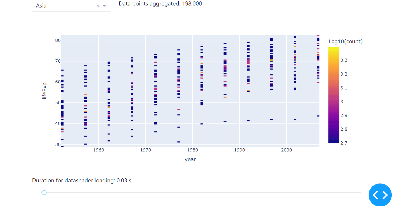
13.3.3 Datashader
Another high-performing way of exploring correlations of large data sets is to use the datashader in combination with plotly. Datashader creates rasterized representations of large data sets for easier visualization, with a pipeline approach consisting of several steps: projecting the data on a regular grid, aggregating it by count, and creating a color representation of the grid. Usually, the minimum count will be plotted in black, the maximum in white, and other bright colors ranging logarithmically in between.
Compared to ScatterGL and Plotly Resampler, the datashader differs not only in speed but in the way it visualises data. Instead of the actual data points, it represents the occurence of the observed data, therefore letting you explore the correlation, especially any accumulations of your data set, really fast. We’ll use the same code from the examples above to introduce the datashader, but we’ll change the dropdown to select the continent instead of the country to really make use of the specifications of the datashader. Before you use the datashader, make sure to install the datashader package.
Using the Datashader
As the datashader needs real numbers to process properly, we will use the numeric conversion that comes within the pandas package for the input years and life expectation. We will set:
df_new['year'] = pd.to_numeric(df_new['year'])df_new['lifeExp'] = pd.to_numeric(df_new['lifeExp'])
Run the code below on your computer to see the datashader in action.
See the code
# Import packages
from dash import Dash, dcc, Input, Output
import dash_bootstrap_components as dbc
import datashader as ds
from datetime import datetime
import numpy as np
import pandas as pd
import plotly.express as px

# Setup data
df = px.data.gapminder()[['continent', 'year', 'lifeExp']]
dropdown_list = df['continent'].unique()

# Initialise the App
app = Dash(__name__, external_stylesheets=[dbc.themes.BOOTSTRAP])

# Create app components
markdown = dcc.Markdown(id='our-markdown')
dropdown = dcc.Dropdown(id='our-dropdown', options=dropdown_list, value=dropdown_list[0])
markdown_scatter = dcc.Markdown(id='markdown-scatter')
slider = dcc.Slider(id='our-slider', min=0, max=50000, marks=None, value=0)

# App Layout
app.layout = dbc.Container(
    [
        dbc.Row([dbc.Col(dropdown, width=3), dbc.Col(markdown, width=9)]),
        dbc.Row([dbc.Col(dcc.Graph(id='our-figure'))]),
        dbc.Row([dbc.Col(markdown_scatter)]),
        dbc.Row(dbc.Col(slider)),
    ]
)


# Configure callbacks
@app.callback(
    Output(component_id='our-markdown', component_property='children'),
    Input(component_id='our-dropdown', component_property='value'),
    Input(component_id='our-slider', component_property='value'),
)
def update_markdown(value_dropdown, value_slider):
    df_sub = df[df['continent'].isin([value_dropdown])]
    title = 'Data points aggregated: {:,}'.format(len(df_sub.index) * value_slider)
    return title


@app.callback(
    Output(component_id='our-figure', component_property='figure'),
    Output(component_id='markdown-scatter', component_property='children'),
    Input(component_id='our-dropdown', component_property='value'),
    Input(component_id='our-slider', component_property='value'),
)
def update_graph(value_dropdown, value_slider):
    df_sub = df[df['continent'].isin([value_dropdown])]
    df_new = pd.DataFrame(np.repeat(df_sub.to_numpy(), value_slider, axis=0), columns=df_sub.columns)
    df_new['year'] = pd.to_numeric(df_new['year'])
    df_new['lifeExp'] = pd.to_numeric(df_new['lifeExp'])
    start_time = datetime.now()
    cvs = ds.Canvas(plot_width=100, plot_height=100)
    agg = cvs.points(df_new, 'year', 'lifeExp')
    zero_mask = agg.values == 0
    agg.values = np.log10(agg.values, where=np.logical_not(zero_mask))
    agg.values[zero_mask] = np.nan
    fig = px.imshow(agg, origin='lower', labels={'color': 'Log10(count)'})
    end_time = datetime.now()
    subtitle = 'Duration for datashader loading: {} s'.format(round((end_time - start_time).total_seconds(), 2))
    return fig, subtitle


# Run the App
if __name__ == '__main__':
    app.run_server(debug=True)
13.4 Caching
Caching, also known as Memoization, is a method used in computer science to speed up calculations by storing data so that future requests for that data can be served faster. Typically, this data stored in a cache is the result of an earlier computation. This way, repeated function calls that are made with the same parameters won’t have to be calculated multiple times. One popular use case may be recursive functions. More general, whenever you process repetitive but difficult or time-consuming calculations within your app, you might want to use caching as it allows you to store calculations to speed up your app performance.
Memoization
For an exemplary introduction to memoization and the implementation in Python also have a look at Towards Data Science or Real Python.
Let’s stick with a minimal example of the one that we have used throughout this chapter; that is, only a dropdown with a graph, but we’ll add a repetitive, time-consuming functionality. Defining our own function calculation_function, we assure that whenever the callback for the graph gets triggered by selecting another country, we delay the app by three seconds. This will simulate a calculation that takes three seconds.
Here is when caching comes into play: By storing the functions’ values for the selected countries i.e., remembering the country in the cache, the respective calculation does not have to be executed the next time. We will use the lru_cache (LRU for Least Recently Used) decorator from the functools package that goes in front our function and takes in the maximal size of values that can be stored as a parameter.
Copy the code below and run it on your computer to see a minimal example on how to implement caching.
# Import packages
from dash import Dash, dcc, Input, Output
import dash_bootstrap_components as dbc
from functools import lru_cache
import plotly.express as px
import time

# Setup data
df = px.data.gapminder()[['country', 'year', 'lifeExp']]
dropdown_list = df['country'].unique()

# Define own functionality and initialise cache
@lru_cache(maxsize=len(dropdown_list))
def calculation_function(string):
    time.sleep(3)
    return string


# Initialise the App
app = Dash(__name__, external_stylesheets=[dbc.themes.BOOTSTRAP])

# Create app components
dropdown = dcc.Dropdown(id='our-dropdown', options=dropdown_list, value=dropdown_list[0])

# App Layout
app.layout = dbc.Container(
    [
        dbc.Row([dbc.Col(dropdown)]),
        dbc.Row([dbc.Col(dbc.Spinner(children=dcc.Graph(id='our-figure')))]),
    ]
)


# Configure callbacks
@app.callback(
    Output(component_id='our-figure', component_property='figure'),
    Input(component_id='our-dropdown', component_property='value'),
)
def update_graph(value_dropdown):
    calculation_function(value_dropdown)
    df_sub = df[df['country'].isin([value_dropdown])]
    fig = px.scatter(
        df_sub,
        x='year',
        y='lifeExp',
        title='PX scatter plot',
        template='plotly_white',
    )
    fig.update_traces(marker=dict(size=20))
    return fig


# Run the App
if __name__ == '__main__':
    app.run_server(debug=True)
Summary
This chapter gave an introduction on how to analyse large data sets with Dash in case you face app performance issues at some point in time. The first functionality that will help you to understand the performance of your app are the built-in Dash Developer Tools. When it comes to implementing higher performance within your app you have learned about different ways of higher performing graphs: ScatterGL, Plotly Resampler and the Datashader. Lastly, memorising difficult as well as repetitive calculations can be handled by storing the results in the cache. Combining everything you have learned so far will allow you to build dash apps that are not only functional but also performant.