
Chapter 1: Introduction to Dashboards
Contents
Chapter 1: Introduction to Dashboards
These days, understanding data is the key to making the best decisions for any business. However, the amount of information that’s available can be overwhelming for the most data-savvy people.
So what’s the key to making data-driven decisions? Finding the most important data by formatting it in a way that’s easy to understand. This can change, depending on who will view the data.
One of the easiest ways to make data easy to understand for technical and non-technical audiences is to create a dashboard that neatly displays all of your data visualizations in one place.
Learning Intentions
In this chapter, we cover the following topics:
Learning Intentions
What is a dashboard?
Principles of effective dashboard design
Benefits of dashboards in data analysis projects
Building dashboards with Dash
What is a dashboard?
A dashboard is a type of graphical user interface which often provides at-a-glance views of key performance indicators (KPIs) relevant to a particular objective or data-driven process. In essence, a dashboard is a board that draws the user’s attention to important numbers and graphs that tell a certain story.
Dashboards aggregate data from multiple data sources like APIs and files such as Excel spreadsheets or Google Sheets. Unlike a spreadsheet, a dashboard allows you to analyze your data through a combination of tables, graphs, and interactive user input. A dashboard isn’t just about saving time, but seeing all of your data together in one place. Unlike a classic business report, a dashboard sets itself apart by shifting the perspective from periodic reporting to constant monitoring and live updates.
The visualizations within dashboards serve multiple purposes. The common roles are:
show change in data over time
indicate how data is distributed
compare values between groups
observe relationships between variables
offer insight on geographical data
offer insight on trends, predictions, or inefficiencies
Principles of effective dashboard design
When working on a dashboard you should always start by asking yourself who the audience is. It might be the case that you are your own audience if you choose to build the dashboard for yourself. Once you identified the audience, you should ask yourself, what the audience goal is. Are they trying to improve a business project? Are they trying to predict outcomes or identify trends? Maybe they’re trying to find errors in current processes and improve efficiency.
Next, you should consider the information that the audience needs to accomplish their goal. Once you get access to that information you may want to start building the visualizations for the dashboard. However, not all visualizations serve the same purpose and some are easier to understand than others. Therefore, you should think of your audience’s level of expertise and familiarity with the data. How well do they know their data? How much experience do they have with reading graphs and interpreting different graph types? Do they have any preferences for certain visualizations and colours?
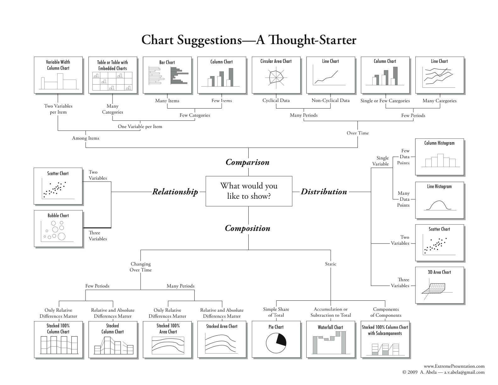
One good starting point when referring to the right visualizations could be the Chart Suggestions image below.

For a full screen view of the image.
Image source: https://extremepresentation.com/2010/12/tools/
Additional Resources
For further exploration, you might want to look at the Chart Tutorial or the Chart Chooser.
Benefits of dashboards in data analysis projects
Overall, dashboards are essential for any holistic analysis of data. There are many benefits to using dashboards, but the most common ones include the following:
Allows people without programming skills to understand data better
Engages users in data exploration (when compared to static visualizations or spreadsheets)
Leads to more engaging storytelling (such as data journalism)
Solves for the difficulty of exploring very large datasets
Can present data in real time and offer live updates
Building dashboards with Dash
We believe Dash is the best tool for building powerful interactive dashboards. Dashboards built with Dash give a point-and-click interface to models written in Python, vastly expanding the notion of what’s possible in a traditional dashboard. That’s why we refer to dashboards created with Dash as Dash apps or data apps. Dash requires very little knowledge of Python, and its creations can be shared on the web with anyone.