
Chapter 12 Advanced Styling and Layout
Contents
Chapter 12 Advanced Styling and Layout
What you will learn
How to set a theme with a CSS stylesheet
How elements of a theme are styled
A variety of classnames
text color
text-primarybackground color
bg-primarymargin
m-1padding
p-1rounded edges
roundedopacity
opacity-25
How to reference multiple features in the same className
Special layout attributes for the
dbc.Row()Special layout attributes for the
dbc.Container()How to modify the layout with
style
12.1 The theme of a Dash app
Let’s start by learning how to set a theme with external_stylesheets=[dbc.themes.<theme>] where '<theme>' can be one of:
bootstrap,cosmo,cyborg,darkly,flatly,grid,slate
Your choice of theme will determine the look and feel of a variety of elements in your dashboard, ranging from the color of the background to the opacity of Bootstrap cards.
Here’s how some elements will look like with the bootstrap theme:

And here’s how the same elements will look like with the slate theme:

You can check out more themes and components in dash-bootstrap-components theme explorer.
12.2 Theme and Cascading Style Sheet (CSS)
To set up your Dash app theme you would select a theme like this:
app = Dash(__name__, external_stylesheets=[dbc.themes.SLATE])
What hides behind dbc.themes.SLATE is the following link which points to a certain cascading stylesheet or, CSS. A CSS file defines how Dash components appear in the layout. One such component is the dcc.Markdown() that you can use to insert a title to your app. If, instead of SLATE, you use the BOOTSTRAP theme, external_stylesheets=[dbc.themes.BOOTSTRAP], the default font color of the title will be of a dark grey type with the RGB code (33, 37, 47) and look like this:

This particular color is mapped to text-body in the CSS file.
And if you do a little digging inside the css file, you’ll find one occurence of text-body in the CSS file:
.text-body{--bs-text-opacity:1;color:rgba(var(--bs-body-color-rgb),var(--bs-text-opacity))
This is called a class. All classes are preceded with a period sign. And within the curly brackets we have multiple property-value pairs with a colon separating the property and value, and a semicolon between each pair.
One such property is color with the corresponding value var(--bs-body-color-rgb).
This points to a setting at the start of the document that reveals the rgb() code used by text-body:
bs-body-color-rgb:33,37,43
12.3 Use className to reference a class
Almost all Dash components have an attribute className that lets you reference the name of a class in a CSS file. We will use this className to update the font color of a Dash app.
Some alternatives to text-body are:
className="text-primary"className="text-secondary"className="text-success"className="text-danger"className="text-info"
The below snippet builds on elements and principles of former chapters, and produces a markdown component that you can use as a header for your dashboards.
See Code
from dash import Dash, html, dcc
import dash_bootstrap_components as dbc

app = Dash(__name__, external_stylesheets=[dbc.themes.BOOTSTRAP])
app.layout = dbc.Container(
    [
        dbc.Row(
            [
                dbc.Col(
                    [dcc.Markdown("# Dashboard title")],
                    width=10,
                )
            ]
        )
    ]
)

if __name__=='__main__':
    app.run_server(debug=True)

Above is the output with Dashboard title displayed as a heading in the colorcode we demonstrated earlier. Recall that this color corresponds to the color associated with text-body in the CSS file. In order to change the color just include, for example, className = "text-info" in your dcc.Markdwon() function call.
See Code
from dash import Dash, html, dcc
import dash_bootstrap_components as dbc

app = Dash(__name__, external_stylesheets=[dbc.themes.BOOTSTRAP])

app.layout = dbc.Container(
    [
        dbc.Row(
            [
                dbc.Col(
                    [dcc.Markdown("# Dashboard title", className="text-info")], width=10
                )
            ]
        )
    ]
)
if __name__=='__main__':
    app.run_server(debug=True)

12.3.1 Change background color
Recall that the alternatives to text-body like text-primary and text-secondary aren’t actual colors, but rather pointers to different colors set by the CSS file. So you can think of these options as different possible categories of the information you’d like to display. The same thing goes for other features of our dcc.Markdown() example like background color.
The following snippet changes the white background of the BOOTSTRAP theme to a rich blue color. Notice in the snippet below that all you have to do to change the background color is to include bg-primary in className because bg stands for background.
See Code
from dash import Dash, html, dcc
import dash_bootstrap_components as dbc

app = Dash(__name__, external_stylesheets=[dbc.themes.BOOTSTRAP])
app.layout = dbc.Container(
    [
        dbc.Row(
            [
                dbc.Col(
                    [dcc.Markdown("# Dashboard title", className="bg-primary")],
                    width=10,
                )
            ]
        )
    ]
)
if __name__=='__main__':
    app.run_server(debug=True)

Above, we’ve only changed the background color, and let the text color remain text-body. The following sections will demonstrate how to edit multiple features at the same time.
Warning
Misspellings in classes assigned to className do not raise any errors; they are merely ignored if they cannot be interpreted.
12.3.2 Using multiple classes
In order to change text color and background color at the same time, just include both text-info and bg-primary separated by space inside className:
See Code
from dash import Dash, html, dcc
import dash_bootstrap_components as dbc

app = Dash(__name__, external_stylesheets=[dbc.themes.BOOTSTRAP])
app.layout = dbc.Container(
    [
        dbc.Row(
            [
                dbc.Col(
                    [
                        dcc.Markdown(
                            "# Dashboard title", className="text-info bg-primary"
                        )
                    ],
                    width=10,
                )
            ]
        )
    ]
)
if __name__=='__main__':
    app.run_server(debug=True)

12.3.3 Spacing, margins and padding
When building the app layout, the default margins and padding is equal to zero. To add space around components or their text, you can use m for margin and p for padding. Then, you would need to declare what side you would like to modify:
t-topfor classes that set margin-top or padding-topb-bottomfor classes that set margin-bottom or padding-bottoms-startfor classes that set margin-left or padding-lefte-endfor classes that set margin-right or padding-rightx- for classes that set both *-left and *-righty- for classes that set both *-top and *-bottomblank- for classes that set a margin or padding on all 4 sides of the element
Finally, you would need to state the size of margin or padding that you would like to add. size can be one of 0, 1, 2, 3, 4, 5 where 0 eliminates the margin or padding.
Let’s see an example where we add 2 units of margin around the highlighted text and its parent Div.
See Code
from dash import Dash, html, dcc
import dash_bootstrap_components as dbc

app = Dash(__name__, external_stylesheets=[dbc.themes.BOOTSTRAP])
app.layout = dbc.Container(
    [
        dbc.Row(
            [
                dbc.Col(
                    [
                        dcc.Markdown(
                            "# Dashboard title", className="text-info bg-primary m-2"
                        )
                    ]
                )
            ],
            className="bg-secondary",
        )
    ]
)

if __name__=='__main__':
    app.run_server(debug=True)

12.3.4 Component placement
You should expect that different components from different libraries such as dcc, dbc and html come with different default settings with regards to margins, paddings and other features such as text alignment. This section will demonstrate how to handle different settings and make sure your layout turns out the way you want it to.
So lets take the setup that we’ve already got, and add a row with a dbc.Label component. We won’t define any margins or padding, but we’ll add some background color to discern the different elements.
See Code
from dash import Dash, html, dcc
import dash_bootstrap_components as dbc

app = Dash(__name__, external_stylesheets=[dbc.themes.BOOTSTRAP])
app.layout = dbc.Container(
    [
        dbc.Row(
            [
                dbc.Col(
                    [
                        dcc.Markdown(
                            "#### Dashboard title", className="text-info bg-primary"
                        )
                    ]
                )
            ],
            className="bg-secondary",
        ),
        dbc.Row(
            [dbc.Col([dbc.Label("Label 1", className="bg-warning")])],
            className="bg-secondary",
        ),
    ]
)
if __name__=='__main__':
    app.run_server(debug=True)

As it now stands, the dashboard isn’t exactly very pleasing to the eye. The two rows have got the same widths, but the background color of each one spans a different width. In addition, the paddings for “Dashboard title” and “Label 1” look very different; this is because dcc and dbc come with different default settings with regards to margins, paddings and other styling features.
The first thing we’ll do is add p-1 in className="text-info bg-primary p-1" for the dcc.Markdown component and p-2 in className = "bg-warning p-2" for the dbc.Label component. This will generate the same spacing around the texts Dashboard title and Label 1.

Another consequence is that the markdown and label components’ backgrounds no longer have a gap between them. If you’d like to keep the gap, you can choose to include it through either component. The image below shows the effect of including mt-2 in className="bg-warning p-2 mt-2" for the dbc.Label component:

See Code
from dash import Dash, html, dcc
import dash_bootstrap_components as dbc

app = Dash(__name__, external_stylesheets=[dbc.themes.BOOTSTRAP])
app.layout = dbc.Container(
    [
        dbc.Row(
            [
                dbc.Col(
                    [
                        dcc.Markdown(
                            "#### Dashboard title", className="text-info bg-primary p-1"
                        )
                    ]
                )
            ],
            className="bg-secondary",
        ),
        dbc.Row(
            [dbc.Col([dbc.Label("Label 1", className="bg-warning p-2 mt-2")])],
            className="bg-secondary",
        ),
    ]
)
if __name__=='__main__':
    app.run_server(debug=True)
12.3.5 Set width with style prop
With the style prop, you can set the components widths to fill any percentage of the parent component, or to a certain amount of pixels. For the latter you’ll use style = {'width':'100px'}, and for the former you can use either style={'width':'100%} or style={'width':'100pc}. Let’s add the style={'width':'75%} to both components:
See Code
from dash import Dash, html, dcc
import dash_bootstrap_components as dbc

app = Dash(__name__, external_stylesheets=[dbc.themes.BOOTSTRAP])
app.layout = dbc.Container(
    [
        dbc.Row(
            [
                dbc.Col(
                    [
                        dcc.Markdown(
                            "#### Dashboard title",
                            className="text-info bg-primary m-0",
                            style={"width": "75%"},
                        )
                    ]
                )
            ],
            className="bg-secondary ",
        ),
        dbc.Row(
            [
                dbc.Col(
                    [
                        dbc.Label(
                            "Label 1", className="bg-warning", style={"width": "75%"}
                        )
                    ]
                )
            ],
            className="bg-secondary",
        ),
    ]
)
if __name__=='__main__':
    app.run_server(debug=True)

Note
What you can do with className you can, for the most part, also do with style and vice versa. However, the attributes of your components are often referenced differently. One example is "fw-bold" for className and "font-weight":"bold" for style. The result will be the same, namely a bold font type for the object in question.
12.4 More components and attributes
In this section you’ll learn how to build on the previous examples and approach something that looks more like a complete dashboard by adding a dbc.Button() and a dbc.Card() component. The Card is often used to split a dashboard in different parts, and it serves as a container for more components. You’ll also learn how to edit the appearance of your components with effects such as rounded edges and shadows.
12.4.1 Button and card
We’ll add a dbc.Button in a new dbc.Col component next to the already existing dbc.Label. In addition, we’ll include a dbc.Card in a dbc.Col component within a new dbc.Row.
See Code
from dash import Dash, html, dcc
import dash_bootstrap_components as dbc

app = Dash(__name__, external_stylesheets=[dbc.themes.BOOTSTRAP])
app.layout = dbc.Container(
    [
        dbc.Row(
            [
                dbc.Col(
                    [
                        dcc.Markdown(
                            "#### Dashboard title",
                            className="text-info bg-primary",
                            style={"width": "100%"},
                        )
                    ]
                )
            ],
            className="text-info bg-secondary m-0",
        ),
        dbc.Row(
            [
                dbc.Col(
                    [
                        dbc.Label(
                            "Label 1",
                            className="bg-warning m-0",
                            style={"width": "100%"},
                        )
                    ],
                    width=4,
                ),
                dbc.Col(
                    dbc.Button(
                        "Click me",
                        className="",
                    ),
                    width=4,
                ),
            ],
            className="bg-secondary m-0",
        ),
        dbc.Row(
            dbc.Col(
                dbc.Card(
                    "Put your content here",
                    className="",
                ),
                width=12,
            )
        ),
    ],
    className="",
)
if __name__=='__main__':
    app.run_server(debug=True)

12.4.2 Justify row components
In the previous code snippet, we’ve used width = 4 for both the label and the button, which by default are placed at the start of the parent row component. To change this, you can include justify='<option>' in the row component, where your options are:
start,center,end,around,between,evenly
The image below shows the result for justify='evenly'. In addition, we’ve included some margins and padding to make the title, label and button look a little nicer.
See Code
from dash import Dash, html, dcc
import dash_bootstrap_components as dbc

app = Dash(__name__, external_stylesheets=[dbc.themes.BOOTSTRAP])
app.layout = dbc.Container(
    [
        dbc.Row(
            [
                dbc.Col(
                    [
                        dcc.Markdown(
                            "#### Dashboard title",
                            className="text-info bg-primary p-2",
                            style={"width": "100%"},
                        )
                    ],
                    className="mt-2",
                )
            ],
            className="text-info bg-secondary m-0",
        ),
        dbc.Row(
            [
                dbc.Col(
                    [
                        dbc.Label(
                            "Label 1",
                            className="bg-warning mt-2 p-2",
                            style={"width": "100%", "height": "65%"},
                        )
                    ],
                    width=4,
                ),
                dbc.Col(
                    dbc.Button(
                        "Click me",
                        className="m-2",
                    ),
                    width=4,
                ),
            ],
            className="bg-secondary m-0",
            justify="evenly",
        ),
        dbc.Row(
            dbc.Col(
                dbc.Card(
                    "Put your card content here",
                    className="",
                ),
                width=12,
            )
        ),
    ],
    className="mt-2",
)
if __name__=='__main__':
    app.run_server(debug=True)

12.4.3 Set height with style
Notice how we’ve cheated a bit in the snippet above by adding 'height':'65%' for the label component style to make it align better to the button. Before you’re ready to fill your card with more components, it’s often a good idea to increase the height of the card to give a better impression of how it will all look when your dashboard is nearing completion. In the snippet below, we’ve included 'height':'200px' for the label style attribute.
See Code
from dash import Dash, html, dcc
import dash_bootstrap_components as dbc

app = Dash(__name__, external_stylesheets=[dbc.themes.BOOTSTRAP])
app.layout = dbc.Container(
    [
        dbc.Row(
            [
                dbc.Col(
                    [
                        dcc.Markdown(
                            "#### Dashboard title",
                            className="text-info bg-primary p-2",
                            style={"width": "100%"},
                        )
                    ],
                    className="mt-2",
                )
            ],
            className="text-info bg-secondary m-0",
        ),
        dbc.Row(
            [
                dbc.Col(
                    [
                        dbc.Label(
                            "Label 1",
                            className="bg-warning mt-2 p-2",
                            style={"width": "100%", "height": "65%"},
                        )
                    ],
                    width=4,
                ),
                dbc.Col(
                    dbc.Button(
                        "Click me",
                        className="m-2",
                    ),
                    width=4,
                ),
            ],
            className="bg-secondary m-0",
            justify="evenly",
        ),
        dbc.Row(
            dbc.Col(
                dbc.Card(
                    "Put your card content here",
                    className=" mt-2",
                    style={"height": "200px"},
                ),
                width=12,
            )
        ),
    ],
    className="bg-mt-2",
)
if __name__=='__main__':
    app.run_server(debug=True)

12.4.4 Rounded edges
If you look closely at the edges of the card, you’ll see that they are rounded by default. In order to apply rounded edges to other components, simply include "rounded" in className. You can adjust the “weight” of the rounding by setting rounded-{size} where size can range from 0 to 3. You can also specify which corners to round through rounded-{corner}, where corner can be:
top,bottom,start,end,circle,pill
The last two options will change not only the corners but the complete structure of the whole card to become circle or pill shaped.
In the snippet below, we’ve rounded off the bottom of the card only, and set the weight to 3.
See Code
from dash import Dash, html, dcc
import dash_bootstrap_components as dbc

app = Dash(__name__, external_stylesheets=[dbc.themes.BOOTSTRAP])
app.layout = dbc.Container(
    [
        dbc.Row(
            [
                dbc.Col(
                    [
                        dcc.Markdown(
                            "#### Dashboard title",
                            className="text-info bg-primary p-2",
                            style={"width": "100%"},
                        )
                    ],
                    className="mt-2",
                )
            ],
            className="text-info bg-secondary m-0",
        ),
        dbc.Row(
            [
                dbc.Col(
                    [
                        dbc.Label(
                            "Label 1",
                            className="bg-warning mt-2 p-2",
                            style={"width": "100%", "height": "65%"},
                        )
                    ],
                    width=4,
                ),
                dbc.Col(
                    dbc.Button(
                        "Click me",
                        className="m-2",
                    ),
                    width=4,
                ),
            ],
            className="bg-secondary m-0",
            justify="evenly",
        ),
        dbc.Row(
            dbc.Col(
                dbc.Card(
                    "Put your card content here",
                    className="mt-2 border rounded-0 rounded-bottom",
                    style={"height": "200px"},
                ),
                width=12,
            )
        ),
    ],
    className="mt-1",
)
if __name__=='__main__':
    app.run_server(debug=True)

12.4.5 Borders
So far, the background colors of the row and column components have served a purpose of visually discerning the various components rather than improving the aesthetics of the dashboard. So let’s drop the background color, and rather separate the title from the components with a border.
You can set the size of the border line with border-{size} where size can range from 1 to 5. As with rounded, you can set the position of the border with border-{direction} where direction can be:
top,end,bottom,start
In the snippet below we’ve added a thick grey border line below the title by adding className="border-top border-white border-3" to the second dbc.Row component.
We’ve also dropped the background colors for some of the components, and rather added a background color and some margins and padding to the dbc.Container itself with className='bg-secondary mt-1 p-3'
See Code
from dash import Dash, html, dcc
import dash_bootstrap_components as dbc

app = Dash(__name__, external_stylesheets=[dbc.themes.BOOTSTRAP])
app.layout = dbc.Container(
    [
        dbc.Row(
            [
                dbc.Col(
                    [
                        dcc.Markdown(
                            "#### Dashboard title",
                            className="text-info p-2",
                            style={"width": "100%"},
                        )
                    ],
                    className="mt-2",
                )
            ],
            className="text-info bg-secondary m-0",
        ),
        dbc.Row(
            [
                dbc.Col(
                    [
                        dbc.Label(
                            "Label 1",
                            className="bg-warning mt-2 p-2",
                            style={"width": "100%", "height": "65%"},
                        )
                    ],
                    width=4,
                ),
                dbc.Col(
                    dbc.Button(
                        "Click me",
                        className="m-2",
                    ),
                    width=4,
                ),
            ],
            className="border-top border-white border-3 m-0",
            justify="evenly",
        ),
        dbc.Row(
            dbc.Col(
                dbc.Card(
                    "Put your card content here",
                    className=" mt-2 rounded-0 rounded-bottom rounded-4",
                    style={"height": "200px"},
                ),
                width=12,
            )
        ),
    ],
    className="bg-secondary mt-1 p-3",
)
if __name__=='__main__':
    app.run_server(debug=True)

12.4.6 Opacity
If you find that bg-secondary for the db.Container comes off as a bit too dominating, you can adjust the opacity of the background color with opacity-{number} where number can be 25, 50 or 75. Below we’ve used bg-opacity-75 and also rounded off the dbc.Container corners with className='bg-secondary bg-opacity-75 rounded-3 mt-1 p-3'.
See Code
from dash import Dash, html, dcc
import dash_bootstrap_components as dbc

app = Dash(__name__, external_stylesheets=[dbc.themes.BOOTSTRAP])
app.layout = dbc.Container(
    [
        dbc.Row(
            [
                dbc.Col(
                    [
                        dcc.Markdown(
                            "#### Dashboard title",
                            className="text-info p-2",
                            style={"width": "100%"},
                        )
                    ],
                    className="mt-2",
                )
            ],
            className="text-info m-0",
        ),
        dbc.Row(
            [
                dbc.Col(
                    [
                        dbc.Label(
                            "Label 1",
                            className="bg-warning mt-2 p-2",
                            style={"width": "100%", "height": "65%"},
                        )
                    ],
                    width=4,
                ),
                dbc.Col(
                    dbc.Button(
                        "Click me",
                        className="m-2",
                    ),
                    width=4,
                ),
            ],
            className="border-top border-white border-3 m-0",
            justify="evenly",
        ),
        dbc.Row(
            dbc.Col(
                dbc.Card(
                    "Put your card content here",
                    className=" mt-2 rounded-0 rounded-bottom rounded-4",
                    style={"height": "200px"},
                ),
                width=12,
            )
        ),
    ],
    className="bg-secondary bg-opacity-75 rounded-3 mt-1 p-3",
)
if __name__=='__main__':
    app.run_server(debug=True)

12.4.7 Shadow
You can add a bit of depth to your dashboard by adding a shadow to your components with shadow-{size} where size can be left out all together, or set to:
none,sm,lg
The last two options stand for small and large. Below we’ve included shadow-lg for the dbc.Container component.
See Code
from dash import Dash, html, dcc
import dash_bootstrap_components as dbc

app = Dash(__name__, external_stylesheets=[dbc.themes.BOOTSTRAP])
app.layout = dbc.Container(
    [
        dbc.Row(
            [
                dbc.Col(
                    [
                        dcc.Markdown(
                            "#### Dashboard title",
                            className="text-info p-2",
                            style={"width": "100%"},
                        )
                    ],
                    className="mt-2",
                )
            ],
            className="text-info m-0",
        ),
        dbc.Row(
            [
                dbc.Col(
                    [
                        dbc.Label(
                            "Label 1",
                            className="bg-warning mt-2 p-2",
                            style={"width": "100%", "height": "65%"},
                        )
                    ],
                    width=4,
                ),
                dbc.Col(
                    dbc.Button(
                        "Click me",
                        className="m-2",
                    ),
                    width=4,
                ),
            ],
            className="border-top border-white border-3 m-0",
            justify="evenly",
        ),
        dbc.Row(
            dbc.Col(
                dbc.Card(
                    "Put your card content here",
                    className=" mt-2 rounded-0 rounded-bottom rounded-4",
                    style={"height": "200px"},
                ),
                width=12,
            )
        ),
    ],
    className="bg-secondary bg-opacity-75 rounded-3 shadow-lg mt-1 p-3",
)
if __name__=='__main__':
    app.run_server(debug=True)

12.4.8 Gradient
Including bg-gradient will add additional depth to the background of your app through a smooth transition between two colors. In order to add more flexibility to the gradient effect of the background color, you’ll have to resort to the style prop. As an example, you can set a background color that transitions from white to grey from the left to the right with:
style={"background": "linear-gradient(90deg, white, grey"}
linear in linear-gradient sets the gradient method. Other alternatives are radial and conic. 90 in 90deg sets the direction through the degrees of the angle of the transition direction.
See Code
from dash import Dash, html, dcc
import dash_bootstrap_components as dbc

app = Dash(__name__, external_stylesheets=[dbc.themes.BOOTSTRAP])
app.layout = dbc.Container(
    [
        dbc.Row(
            [
                dbc.Col(
                    [
                        dcc.Markdown(
                            "#### Dashboard title",
                            className="text-info p-2",
                            style={"width": "100%"},
                        )
                    ],
                    className="mt-2",
                )
            ],
            className="text-info m-0",
        ),
        dbc.Row(
            [
                dbc.Col(
                    [
                        dbc.Label(
                            "Label 1",
                            className="bg-warning mt-2 p-2",
                            style={"width": "100%", "height": "65%"},
                        )
                    ],
                    width=4,
                ),
                dbc.Col(
                    dbc.Button(
                        "Click me",
                        className="m-2",
                    ),
                    width=4,
                ),
            ],
            className="border-top border-white border-3 m-0",
            justify="evenly",
        ),
        dbc.Row(
            dbc.Col(
                dbc.Card(
                    "Put your card content here",
                    className=" mt-2 rounded-0 rounded-bottom rounded-4",
                    style={"height": "200px"},
                ),
                width=12,
            )
        ),
    ],
    className="bg-secondary bg-opacity-75 rounded-3 shadow-lg mt-1 p-3",
    style={"background": "linear-gradient(90deg, white, grey"},
)
if __name__=='__main__':
    app.run_server(debug=True)

The color options are not limited to simple color names like white and grey. You can also use rgb and even rgba to select any color with any grade of transparency you’d like. You can also use multiple colors at the same time to show multiple steps of the gradient. Below is an example that uses red, yellow and a transparent blue with rgba(0, 0 , 255, 0.3). Notice also that we’ve included 70% right after the rgba color. This sets the share of the last color compared to the rest of the colors.
See Code
from dash import Dash, html, dcc
import dash_bootstrap_components as dbc

app = Dash(__name__, external_stylesheets=[dbc.themes.BOOTSTRAP])
app.layout = dbc.Container(
    [
        dbc.Row(
            [
                dbc.Col(
                    [
                        dcc.Markdown(
                            "#### Dashboard title",
                            className="text-info p-2",
                            style={"width": "100%"},
                        )
                    ],
                    className="mt-2",
                )
            ],
            className="text-info m-0",
        ),
        dbc.Row(
            [
                dbc.Col(
                    [
                        dbc.Label(
                            "Label 1",
                            className="bg-warning mt-2 p-2 overflow-auto",
                            style={"width": "100%", "height": "65%"},
                        )
                    ],
                    width=4,
                ),
                dbc.Col(
                    dbc.Button(
                        "Click me",
                        className="m-2",
                    ),
                    width=4,
                ),
            ],
            className="border-top border-white border-3 m-0",
            justify="evenly",
        ),
        dbc.Row(
            dbc.Col(
                dbc.Card(
                    "Put your card content here",
                    className=" mt-2 rounded-0 rounded-bottom rounded-4",
                    style={"height": "200px"},
                ),
                width=12,
            )
        ),
    ],
    className="bg-secondary bg-opacity-75 rounded-3 shadow-lg mt-2 p-3",
    style={
        "background": "linear-gradient(125deg, red,  yellow, rgba(0, 0, 255, 0.3) 70%"
    },
)
if __name__=='__main__':
    app.run_server(debug=True)

12.4.9 Overflow
So far we haven’t filled any of the components with too much information.
If we set the label to a fixed height of 45px and add a text that’s a bit too long, you’ll see that the default behavior of dbc.Label is to let the content flow over the component.

To change this behavior, include overflow-{option} in className where option can be:
auto,hidden,visible,scroll
Below, we added overflow-auto to the className prop of the label. You can see that a slider with arrows has been added to the label component so that the content can be scrolled. The difference between auto and scroll is that the latter adds both vertical and horizontal sliders by default.

See Code
from dash import Dash, html, dcc
import dash_bootstrap_components as dbc

app = Dash(__name__, external_stylesheets=[dbc.themes.BOOTSTRAP])
app.layout = dbc.Container(
    [
        dbc.Row(
            [
                dbc.Col(
                    [
                        dcc.Markdown(
                            "#### Dashboard title",
                            className="text-info p-2",
                            style={"width": "100%"},
                        )
                    ],
                    className="mt-2",
                )
            ],
            className="text-info m-0",
        ),
        dbc.Row(
            [
                dbc.Col(
                    [
                        dbc.Label(
                            "Very important information that is too long for the component",
                            className="bg-warning mt-2 p-2 overflow-auto",
                            style={"width": "100%", "height": "45px"},
                        )
                    ],
                    width=4,
                ),
                dbc.Col(
                    dbc.Button(
                        "Click me",
                        className="m-2",
                    ),
                    width=4,
                ),
            ],
            className="border-top border-white border-3 m-0",
            justify="evenly",
        ),
        dbc.Row(
            dbc.Col(
                dbc.Card(
                    "Put your card content here",
                    className=" mt-2 rounded-0 rounded-bottom rounded-4",
                    style={"height": "200px"},
                ),
                width=12,
            )
        ),
    ],
    className="bg-secondary bg-opacity-75 rounded-3 mt-1 p-3 bg-gradient",
)
if __name__=='__main__':
    app.run_server(debug=True)
12.5 Dashboard sizing
In our latest examples, the app fills up only a limited space of the background. You can adjust this in many ways depending on the functionalities of your app and screen size. This section will show you how to use the fluid attribute of dbc.Container() to make the app span the entire width of the screen, and how to use style={'height':100vh} to fill the entire height of the screen.
So far, the dashboards we’ve created have had empty space on both sides of the page.
If you would like to fill the entire available horizontal space, you can do so through setting fluid=True for the dbc.Container object.

See Code
from dash import Dash, html, dcc
import dash_bootstrap_components as dbc

app = Dash(__name__, external_stylesheets=[dbc.themes.BOOTSTRAP])
app.layout = dbc.Container(
    [
        dbc.Row(
            [
                dbc.Col(
                    [
                        dcc.Markdown(
                            "#### Dashboard title",
                            className="text-info p-2",
                            style={"width": "100%"},
                        )
                    ],
                    className="mt-2",
                )
            ],
            className="text-info m-0",
        ),
        dbc.Row(
            [
                dbc.Col(
                    [
                        dbc.Label(
                            "Very important information that is too long for the component",
                            className="bg-warning mt-2 p-2 overflow-auto",
                            style={"width": "100%", "height": "45px"},
                        )
                    ],
                    width=4,
                ),
                dbc.Col(
                    dbc.Button(
                        "Click me",
                        className="m-2",
                    ),
                    width=4,
                ),
            ],
            className="border-top border-white border-3 m-0",
            justify="evenly",
        ),
        dbc.Row(
            dbc.Col(
                dbc.Card(
                    "Put your card content here",
                    className=" mt-2 rounded-0 rounded-bottom rounded-4",
                    style={"height": "200px"},
                ),
                width=12,
            )
        ),
    ],
    className="bg-secondary bg-opacity-75 p-3 bg-gradient",
    fluid=True,
)
if __name__=='__main__':
    app.run_server(debug=True)
To fill any extra space vertically, you can apply style={"height": "100vh"} to the dbc.Container.
See Code
from dash import Dash, html, dcc
import dash_bootstrap_components as dbc

app = Dash(__name__, external_stylesheets=[dbc.themes.BOOTSTRAP])
app.layout = dbc.Container(
    [
        dbc.Row(
            [
                dbc.Col(
                    [
                        dcc.Markdown(
                            "#### Dashboard title",
                            className="text-info p-2",
                            style={"width": "100%"},
                        )
                    ],
                    className="mt-2",
                )
            ],
            className="text-info m-0",
        ),
        dbc.Row(
            [
                dbc.Col(
                    [
                        dbc.Label(
                            "Very important information that is too long for the component",
                            className="bg-warning mt-2 p-2 overflow-auto",
                            style={"width": "100%", "height": "45px"},
                        )
                    ],
                    width=4,
                ),
                dbc.Col(
                    dbc.Button(
                        "Click me",
                        className="m-2",
                    ),
                    width=4,
                ),
            ],
            className="border-top border-white border-3 m-0",
            justify="evenly",
        ),
        dbc.Row(
            dbc.Col(
                dbc.Card(
                    "Put your card content here",
                    className=" mt-2 rounded-0 rounded-bottom rounded-4",
                    style={"height": "200px"},
                ),
                width=12,
            )
        ),
    ],
    className="bg-secondary bg-opacity-75 p-3 bg-gradient",
    fluid=True,
    style={"height": "100vh"},
)
if __name__=='__main__':
    app.run_server(debug=True)

12.6 Inspecting layout with browser developer tools
By now you know how to assign different colors and formats to Dash components through className and style. Instead of the CSS approach, you can also retrieve valuable information on colors and formatting by launching your browser’s developer tools. If you’re using Edge or Chrome, you can do so with Ctrl + Shift + I. You can also right-click on the browser and click Inspect.
Once the browser developer tool is open, you can click the icon highlighted in the red rectangle below. Then, hover over any element in your app and retrieve the associated information like this:

In the image above, we’re hovering over the third row component. If you look at the associated div class information to the right you’ll see:
div class="border-top border-white border-3 m-0 justify-content-evenly row"
Notice how all the className elements we’ve added can be found there. In addition, you’ll see how using the justify='evenly' attribute for the dbc.Row component adds justify-content-evenly to the very same component.
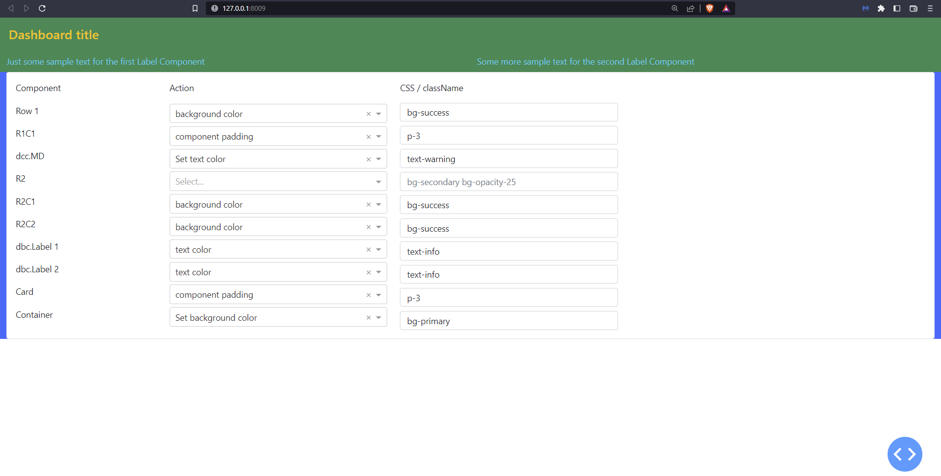
12.7 Practice styling and classes
The following screenshot is an app that we built for you to practice the usage of classes and styles. Copy the code and run the app locally on your computer to start practicing!
See Code
from dash import Dash, html, dcc
import dash_bootstrap_components as dbc
from dash import State, Input, Output, Dash, html, dcc
app = Dash(__name__, external_stylesheets=[dbc.themes.BOOTSTRAP])
# card options
opts_className_1 = [
{"label": "text color", "value": "text-info"},
{"label": "background color", "value": "bg-success"},
{"label": "component margin", "value": "m-1"},
{"label": "component padding", "value": "p-3"},
]
opts_ddn_scnd_title = [
{"label": "Set text color", "value": "text-warning"},
{"label": "Set background color", "value": "bg-primary"},
{"label": "Set component margin", "value": "m-1"},
{"label": "Set component padding", "value": "p-1"},
]
# card controls
ctrls_crd1 = [
dbc.Row(
[
dbc.Col(
[
dbc.Label("Component"),
dcc.Markdown(
"Row 1",
style={"marginTop": "11px", "height": "30px", "width": "200px"},
),
dcc.Markdown(
"R1C1",
style={"marginTop": "12px", "height": "30px", "width": "200px"},
),
dcc.Markdown(
"dcc.MD",
style={"marginTop": "12px", "height": "30px", "width": "200px"},
),
dcc.Markdown(
"R2",
style={"marginTop": "12px", "height": "30px", "width": "200px"},
),
dcc.Markdown(
"R2C1",
style={"marginTop": "12px", "height": "30px", "width": "200px"},
),
dcc.Markdown(
"R2C2",
style={"marginTop": "12px", "height": "30px", "width": "200px"},
),
dcc.Markdown(
"dbc.Label 1",
style={"marginTop": "12px", "height": "30px", "width": "200px"},
),
dcc.Markdown(
"dbc.Label 2",
style={"marginTop": "12px", "height": "30px", "width": "200px"},
),
dcc.Markdown(
"Card",
style={"marginTop": "12px", "height": "30px", "width": "200px"},
),
dcc.Markdown(
"Container",
style={"marginTop": "12px", "height": "30px", "width": "200px"},
),
],
width=2,
),
dbc.Col(
[
dbc.Label("Action"),
dcc.Dropdown(
id="ddn_R1",
options=opts_className_1,
style={"marginTop": "10px", "height": "30px"},
value='bg-success',
clearable=True,
),
dcc.Dropdown(
id="ddn_R1C1",
options=opts_className_1,
style={"marginTop": "12px", "height": "30px"},
value='p-3',
clearable=True,
),
dcc.Dropdown(
id="ddn_MD1",
options=opts_ddn_scnd_title,
style={"marginTop": "12px", "height": "30px"},
value='text-warning',
clearable=True,
),
dcc.Dropdown(
id="ddn_R2",
options=opts_className_1,
style={"marginTop": "12px", "height": "30px"},
clearable=True,
),
dcc.Dropdown(
id="ddn_R2C1",
options=opts_className_1,
style={"marginTop": "12px", "height": "30px"},
value='bg-success',
clearable=True,
),
dcc.Dropdown(
id="ddn_R2C2",
options=opts_className_1,
style={"marginTop": "12px", "height": "30px"},
value='bg-success',
clearable=True,
),
dcc.Dropdown(
id="ddn_LBL1",
options=opts_className_1,
style={"marginTop": "12px", "height": "30px"},
value='text-info',
clearable=True,
),
dcc.Dropdown(
id="ddn_LBL2",
options=opts_className_1,
style={"marginTop": "12px", "height": "30px"},
value='text-info',
clearable=True,
),
dcc.Dropdown(
id="ddn_CRD1",
options=opts_className_1,
style={"marginTop": "12px", "height": "30px"},
value='p-3',
clearable=True,
),
dcc.Dropdown(
id="ddn_CTR1",
options=opts_ddn_scnd_title,
style={"marginTop": "12px", "height": "30px"},
value='bg-primary',
clearable=True,
),
],
width=3,
),
dbc.Col(
[
dbc.Label("CSS / className"),
dbc.Input(
id="ipt_R1",
placeholder="bg-primary border border-5 rounded-3",
type="text",
value='bg-success',
style={"marginTop": "8px", "height": "35px"},
),
dbc.Input(
id="ipt_R1C1",
placeholder="m-2 bg-info rounded-0 rounded-3",
type="text",
style={"marginTop": "8px", "height": "35px"},
),
dbc.Input(
id="ipt_MD1",
placeholder="bg-white m-4 rounded-3 p-2 opacity-75",
type="text",
style={"marginTop": "8px", "height": "35px"},
),
dbc.Input(
id="ipt_R2",
placeholder="bg-secondary bg-opacity-25",
type="text",
style={"marginTop": "8px", "height": "35px"},
),
dbc.Input(
id="ipt_R2C1",
placeholder="Ready",
type="text",
style={"marginTop": "8px", "height": "35px"},
),
dbc.Input(
id="ipt_R2C2",
placeholder="Ready",
type="text",
style={"marginTop": "8px", "height": "35px"},
),
dbc.Input(
id="ipt_LBL1",
placeholder="Ready",
type="text",
style={"marginTop": "8px", "height": "35px"},
),
dbc.Input(
id="ipt_LBL2",
placeholder="Ready",
type="text",
style={"marginTop": "8px", "height": "35px"},
),
dbc.Input(
id="ipt_CRD1",
placeholder="p-3 m-4 bg-secondary bg-opacity-50 fw-bold",
type="text",
style={"marginTop": "8px", "height": "35px"},
),
dbc.Input(
id="ipt_CTR1",
placeholder="rounded-3 mt-3",
type="text",
style={"marginTop": "8px", "height": "35px"},
),
],
width=3,
)
],
),
]
app.layout = dbc.Container(
[
dbc.Row(
[
dbc.Col(
[
dcc.Markdown(
"#### Dashboard title",
id="MD1"
)
# COLUMN
],
id="R1C1",
),
# ROW
],
id="R1"
),
dbc.Row(
[
dbc.Col(
[
dbc.Label(
"Just some sample text for the first Label Component",
id="LBL1",
)
# COLUMN
],
id="R2C1",
),
dbc.Col(
[
dbc.Label(
"Some more sample text for the second Label Component",
id="LBL2",
)
# COLUMN
],
id="R2C2",
),
],
id="R2",
),
dbc.Row(
[
dbc.Col(
[
dbc.Card(
ctrls_crd1,
id="CRD1",
)
],
)
],
),
],
id="CTR1",
fluid=True,
)
# Callbacks R1 ################################################################
# Set Row1 / R1 className through main_title_css chained to main_title_layout():
@app.callback(
Output("ipt_R1", "value"),
[
Input("ddn_R1", "value"),
],
)
def component_layout(cName_element):
return cName_element
@app.callback(
Output("R1", "className"),
[
Input("ipt_R1", "value"),
],
)
def component_css(cName_element):
return cName_element
# Callbacks R1C1 ################################################################
@app.callback(
Output("ipt_R1C1", "value"),
[
Input("ddn_R1C1", "value"),
],
)
def component_layout(cName_element):
return cName_element
@app.callback(
Output("R1C1", "className"),
[
Input("ipt_R1C1", "value"),
],
)
def component_css(cName_element):
return cName_element
# Callbacks MD1 ################################################################
@app.callback(
Output("ipt_MD1", "value"),
[
Input("ddn_MD1", "value"),
],
)
def component_layout(cName_element):
return cName_element
@app.callback(
Output("MD1", "className"),
[
Input("ipt_MD1", "value"),
],
)
def component_css(cName_element):
return cName_element
# Callbacks R2 ################################################################
@app.callback(
Output("ipt_R2", "value"),
[
Input("ddn_R2", "value"),
],
)
def component_layout(cName_element):
return cName_element
@app.callback(
Output("R2", "className"),
[
Input("ipt_R2", "value"),
],
)
def component_css(cName_element):
return cName_element
# Callbacks R2C1 ################################################################
@app.callback(
Output("ipt_R2C1", "value"),
[
Input("ddn_R2C1", "value"),
],
)
def component_layout(cName_element):
return cName_element
@app.callback(
Output("R2C1", "className"),
[
Input("ipt_R2C1", "value"),
],
)
def component_css(cName_element):
return cName_element
# Callbacks R2C2 ################################################################
@app.callback(
Output("ipt_R2C2", "value"),
[
Input("ddn_R2C2", "value"),
],
)
def component_layout(cName_element):
return cName_element
@app.callback(
Output("R2C2", "className"),
[
Input("ipt_R2C2", "value"),
],
)
def component_css(cName_element):
return cName_element
# Callbacks LBL1 ################################################################
@app.callback(
Output("ipt_LBL1", "value"),
[
Input("ddn_LBL1", "value"),
],
)
def component_layout(cName_element):
return cName_element
@app.callback(
Output("LBL1", "className"),
[
Input("ipt_LBL1", "value"),
],
)
def component_css(cName_element):
return cName_element
# Callbacks LBL2 ################################################################
@app.callback(
Output("ipt_LBL2", "value"),
[
Input("ddn_LBL2", "value"),
],
)
def component_layout(cName_element):
return cName_element
@app.callback(
Output("LBL2", "className"),
[
Input("ipt_LBL2", "value"),
],
)
def component_css(cName_element):
return cName_element
# Callbacks CRD1 ################################################################
@app.callback(
Output("ipt_CRD1", "value"),
[
Input("ddn_CRD1", "value"),
],
)
def component_layout(cName_element):
return cName_element
@app.callback(
Output("CRD1", "className"),
[
Input("ipt_CRD1", "value"),
],
)
def component_css(cName_element):
return cName_element
# Callbacks CTR1 ################################################################
@app.callback(
Output("ipt_CTR1", "value"),
[
Input("ddn_CTR1", "value"),
],
)
def component_layout(cName_element):
return cName_element
@app.callback(
Output("CTR1", "className"),
[
Input("ipt_CTR1", "value"),
],
)
def component_css(cName_element):
return cName_element
if __name__=='__main__':
app.run_server(debug=True, port=8009)
Exercises
In the exercises below, we will apply the strategies learnt in this chapter to style a few of the apps we built previously.
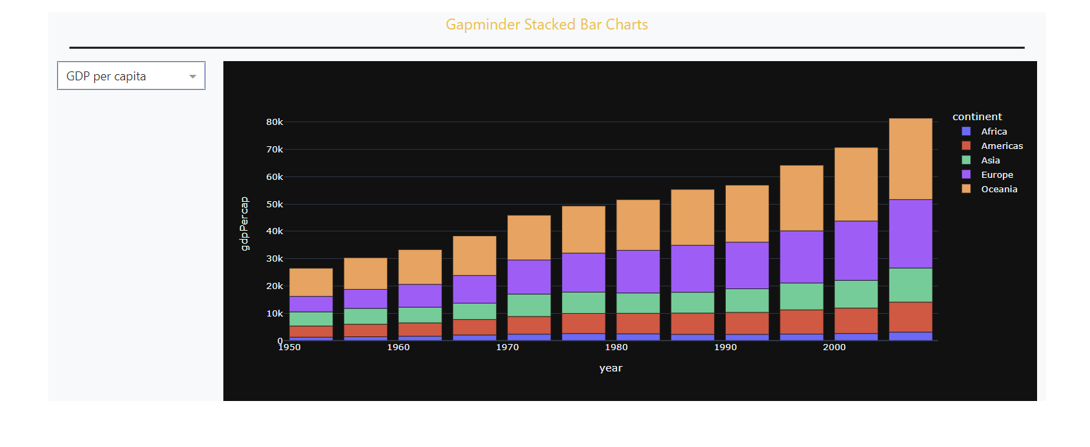
(1) Starting from the app we built in exercise 8.2, just by adding the right className to the right components, perform the following layout enhancements:
(1) Starting from the app we built in exercise 8.2, add the className props to achieve the following layout enhancements:
Adjust the title text to make it orange.
Add a dark line below the title as size 3.
Make the border of the dropdown component blue
Make the background of the app layout container the color light grey.
See Solution
from dash import Dash, dcc, Output, Input
import pandas as pd
import plotly.express as px
import dash_bootstrap_components as dbc

# data
df = px.data.gapminder()
df = df.groupby(['year','continent']).agg({'pop':'sum', 'gdpPercap':'mean','lifeExp':'mean'}).reset_index()

# Dash App
app = Dash(__name__, external_stylesheets=[dbc.themes.BOOTSTRAP])

# Create app components
title_ = dcc.Markdown(children='Gapminder Stacked Bar Charts', style={'textAlign': 'center','fontSize': 25}, className='text-dark')
dropdown_ = dcc.Dropdown(id='metric-dropdown', placeholder = 'Select a metric',
                        options= [{'label': 'Population', 'value': 'pop'},
                                {'label': 'GDP per capita', 'value': 'gdpPercap'},
                                {'label': 'Life Expectancy', 'value': 'lifeExp'}])
graph_ = dcc.Graph(id='figure1')

# App Layout
app.layout = dbc.Container(
    [
        dbc.Row(
            [
                dbc.Col([title_], width=12)
            ]),
        dbc.Row(
            [
                dbc.Col([dropdown_],
                        className="p-3",
                        width=2),
                dbc.Col(
                        [
                            graph_
                        ],
                        className="p-3",
                        width=10),
            ],
            className="border-top border-dark border-3 m-1",
            justify="evenly"
        )
    ],
    className="bg-secondary bg-opacity-75 m-0 p-3 bg-gradient",
    fluid=True,
    style={"height": "100vh"},
)

# Callbacks
@app.callback(
    Output('figure1','figure'),
    Input('metric-dropdown', 'value'),
    prevent_initial_call=True
)
def update_markdown(metric_):
    fig = px.bar(df, x='year', y=metric_, color='continent', template='plotly_dark')
    return fig

# Run the App
if __name__== '__main__':
    app.run_server()
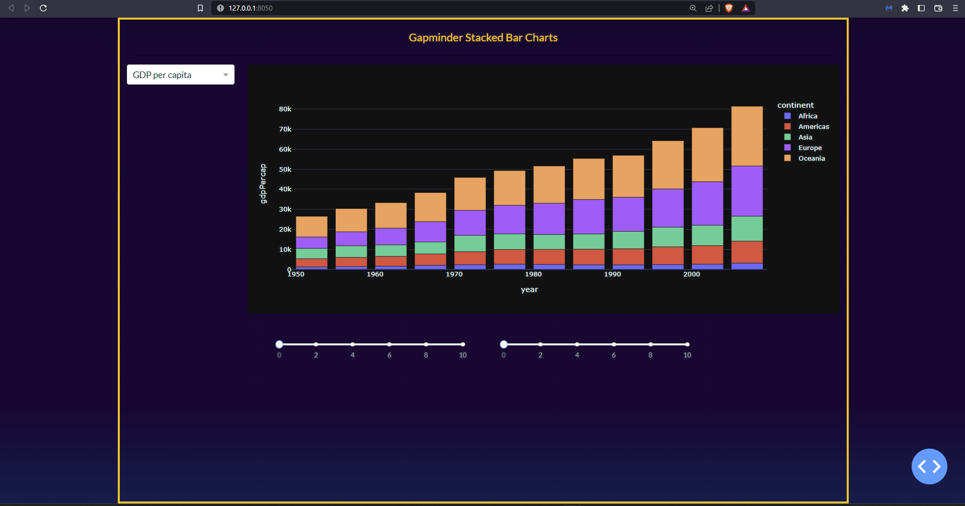
(2) Building on the previous solution, adjust the layout in the following way:
Update the overall theme to VAPOR
Add a row at the bottom of the app. Within that row, add two separate sliders with the following props
(min=0, max=10). Each slider should have a column width of 4Justify the sliders’ row as
centerand add 5 units of paddingAdd an orange border around the app, 4 units thick
Make the app fill the screen vertically so there is no empty space above or below the border you just created
See Solution
from dash import Dash, dcc, Output, Input
import pandas as pd
import plotly.express as px
import dash_bootstrap_components as dbc

# data
df = px.data.gapminder()
df = df.groupby(['year','continent']).agg({'pop':'sum', 'gdpPercap':'mean','lifeExp':'mean'}).reset_index()

# Dash App
app = Dash(__name__, external_stylesheets=[dbc.themes.VAPOR])

# Create app components
title_ = dcc.Markdown(children='Gapminder Stacked Bar Charts',
                      style={'textAlign': 'center','fontSize': 20},
                      className='text-warning')
dropdown_ = dcc.Dropdown(id='metric-dropdown', placeholder = 'Select a metric',
                         className="border border-primary",
                         options= [{'label': 'Population', 'value': 'pop'},
                                {'label': 'GDP per capita', 'value': 'gdpPercap'},
                                {'label': 'Life Expectancy', 'value': 'lifeExp'}],
                         value='gdpPercap',
                         clearable=False)
graph_ = dcc.Graph(id='figure1')

slider_1 = dcc.Slider(min=0, max=10)
slider_2 = dcc.Slider(min=0, max=10)

# App Layout
app.layout = dbc.Container(
    [
        dbc.Row(
            [
                dbc.Col([title_], width=12)
            ],
        className="border-bottom border-dark border-3 m-3"
        ),
        dbc.Row(
            [
                dbc.Col([dropdown_], width=2),
                dbc.Col([graph_], width=10),
            ]
        ),
        dbc.Row(
            [
                dbc.Col([slider_1], width=4),
                dbc.Col([slider_1], width=4),
            ],
        justify='center',
        className='p-5'
       )
    ],
    className='border border-warning border-4', style={'height':'100vh'}
)

# Callbacks
@app.callback(
    Output('figure1','figure'),
    Input('metric-dropdown', 'value'),
)
def update_markdown(metric_):
    fig = px.bar(df, x='year', y=metric_, color='continent', template='plotly_dark')
    return fig

# Run the App
if __name__== '__main__':
    app.run_server(debug=True)
Summary
In this chapter you’ve learned many advanced styling features that will allow you to build a professional-looking app. You are now ready to build powerful Dash apps and explore data sets to help make this world a better place! Remember to start simple and focus on preparing the data set for your graphs first. Then tackle the callback. And when you’re happy with the performance of the app, start working on the layout and styling.