
Chapter 9: DataTables
Contents
Chapter 9: DataTables
What You Will Learn
In this chapter you will learn about Dash DataTables and how to use them to explore and edit data.
Learning Intentions
Building a DataTable
Connecting a DataTable to graph
Important DataTable properties
By the end of this chapter you will know how to build this app:
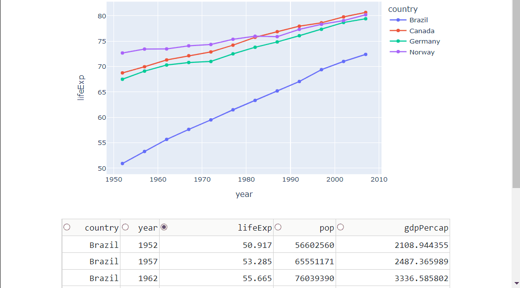
See the code
# Import libraries
from dash import Dash, dash_table, dcc, Input, Output, State
import dash_bootstrap_components as dbc
import pandas as pd
import plotly.express as px


# Import data into Pandas dataframe
df = px.data.gapminder()

# Filter data with a list of countries we're interested in exploring
country_list = ['Canada', 'Brazil', 'Norway', 'Germany']
df = df[df['country'].isin(country_list)]

# Filter columns we want to use
df.drop(['continent', 'iso_alpha', 'iso_num'], axis=1, inplace=True)

# Create a Dash DataTable
data_table = dash_table.DataTable(
        id='dataTable1',
        data=df.to_dict('records'),
        columns=[{'name': i, 'id': i,'selectable':True} for i in df.columns],
        page_size=10,
        column_selectable="single",
        selected_columns=['lifeExp'],
        editable=True
)

# Create a line graph of life expectancy over time
fig = px.line(df, x='year', y='lifeExp', color='country', markers=True)
graph1 = dcc.Graph(id='figure1', figure=fig)

# Create the Dash application with Bootstrap CSS stylesheet
app = Dash(__name__, external_stylesheets=[dbc.themes.BOOTSTRAP])

# Create the app layout
app.layout = dbc.Container(
    dbc.Row([
        dbc.Col([
            graph1,
            data_table,
        ])
    ])
)


# Link DataTable edits to the plot with a callback function
@app.callback(
    Output('figure1', 'figure'),
    Input('dataTable1', 'data'),
    Input('dataTable1', 'columns'),
    Input('dataTable1', 'selected_columns')
)
def display_output(rows, columns, sel_col):
    # Create data frame from data table
    df = pd.DataFrame(rows, columns=[c['name'] for c in columns])
    # Create a new figure to replace previous figure
    fig = px.line(df, x='year', y=sel_col[0], color='country', markers=True)

    return fig

# Launch the app server
if __name__ == '__main__':
    app.run_server()
9.1 Intro to DataTables
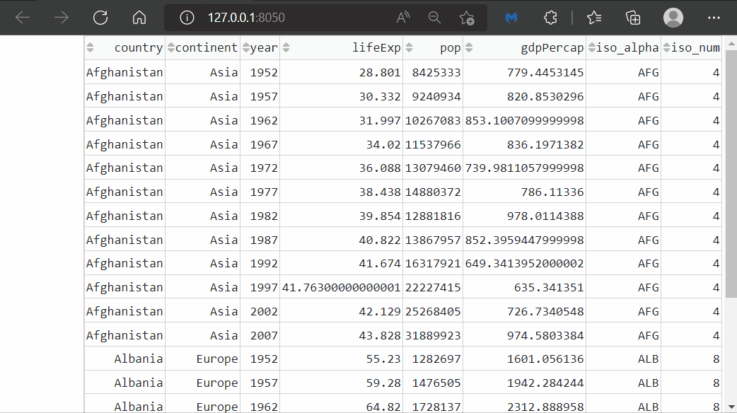
Dash DataTable is an interactive table designed for viewing, editing, and exploring large datasets similar to Microsoft Excel or Google Sheets. To create a basic DataTable all we need to do is define the data property by assigning the dataframe to it.
# Import libraries
from dash import Dash, dash_table
import dash_bootstrap_components as dbc
import pandas as pd
import plotly.express as px

# Import data into Pandas dataframe
df = px.data.gapminder()

# Create a Dash DataTable
data_table = dash_table.DataTable(id="dataTable1", data=df.to_dict('records'))

# Create the Dash application with Bootstrap CSS stylesheet
app = Dash(__name__, external_stylesheets=[dbc.themes.BOOTSTRAP])

# Create the app layout
app.layout = dbc.Container(
    dbc.Row([
        dbc.Col([
            data_table
        ])
    ])
)

# Launch the app server
if __name__ == '__main__':
    app.run_server()
See Table
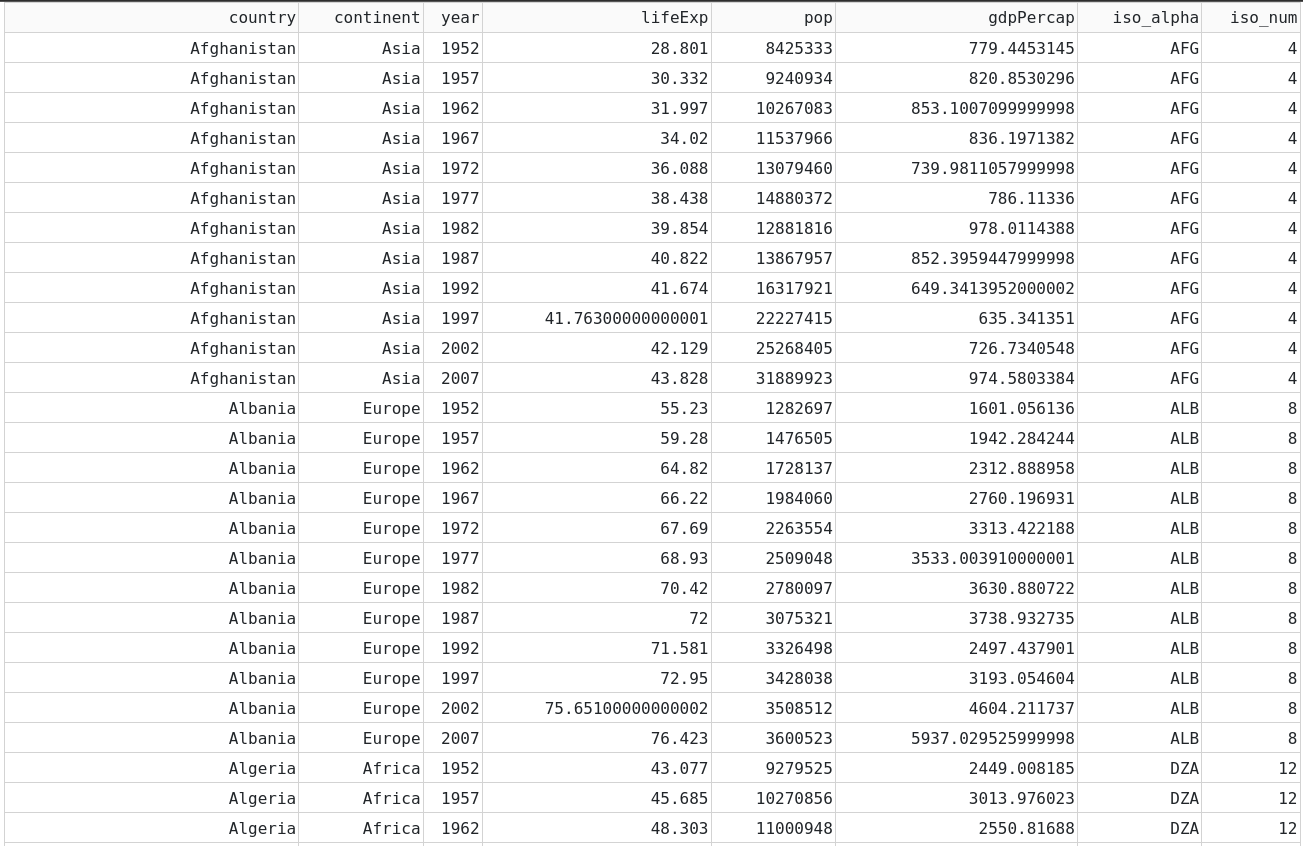
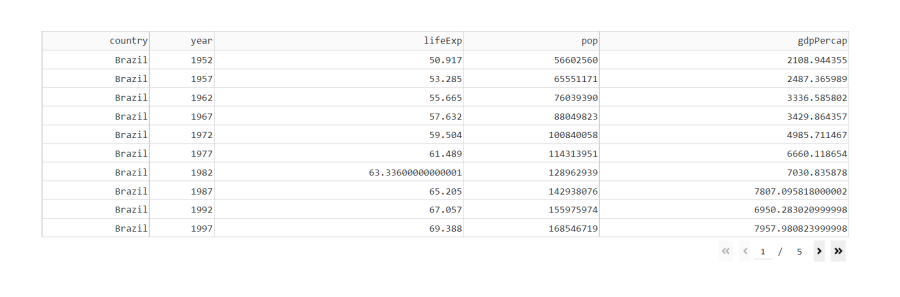
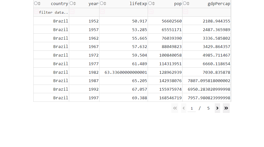
If you run the code above, you’ll see that this dataset is huge and the first page is very long. We can limit the amount of rows displayed per page, by using the page_size property. But that would create 171 pages of DataTables. To limit the size of the dataset, we’ll filter it before building the DataTable to only look at a few countries and remove columns we’re not interested in:
# Import libraries
from dash import Dash, dash_table
import dash_bootstrap_components as dbc
import pandas as pd
import plotly.express as px

# Import data into Pandas dataframe
df = px.data.gapminder()

# Filter data with a list of countries we're interested in exploring
country_list = ['Canada', 'Brazil', 'Norway', 'Germany']
df = df[df['country'].isin(country_list)]

# Filter columns we want to use
df.drop(['continent', 'iso_alpha', 'iso_num'], axis=1, inplace=True)

# Create a Dash DataTable
data_table = dash_table.DataTable(id="dataTable1", data=df.to_dict('records'), page_size=10)

# Create the Dash application with Bootstrap CSS stylesheet
app = Dash(__name__, external_stylesheets=[dbc.themes.BOOTSTRAP])

# Create the app layout
app.layout = dbc.Container(
    dbc.Row([
        dbc.Col([
            data_table
        ])
    ])
)

# Launch the app server
if __name__ == '__main__':
    app.run_server()
See Table
9.2 Linking DataTable to a Graph
Now we will link the DataTable to a Graph and see that the graph changes as we interact with the DataTable.
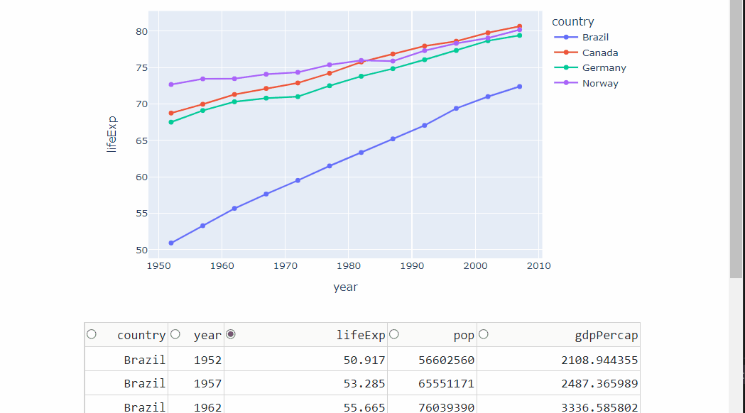
9.2.1 Line Plot
When the columns property of the DataTable is not provided, columns are auto-generated based on the first row in data. However, in this example, we will define the columns property because we want to allow the user to select columns with selectable:True
We’ll also restrict selection to only one column at a time with column_selectable, and we’ll predefine the initial selected column with selected_columns.
The Callback will connect the DataTable to the graph and update its y-axis by being triggered whenever the user selects a column.
# Import libraries
from dash import Dash, dash_table, dcc, Input, Output, State
import dash_bootstrap_components as dbc
import pandas as pd
import plotly.express as px


# Import data into Pandas dataframe
df = px.data.gapminder()

# Filter data with a list of countries we're interested in exploring
country_list = ['Canada', 'Brazil', 'Norway', 'Germany']
df = df[df['country'].isin(country_list)]

# Filter columns we want to use
df.drop(['continent', 'iso_alpha', 'iso_num'], axis=1, inplace=True)

# Create a Dash DataTable
data_table = dash_table.DataTable(
        id='dataTable1',
        data=df.to_dict('records'),
        columns=[{'name': i, 'id': i,'selectable':True} for i in df.columns],
        page_size=10,
        column_selectable="single",
        selected_columns=['lifeExp']
)

# Create a line graph of life expectancy over time
fig = px.line(df, x='year', y='lifeExp', color='country', markers=True)
graph1 = dcc.Graph(id='figure1', figure=fig)

# Create the Dash application with Bootstrap CSS stylesheet
app = Dash(__name__, external_stylesheets=[dbc.themes.BOOTSTRAP])

# Create the app layout
app.layout = dbc.Container(
    dbc.Row([
        dbc.Col([
            graph1,
            data_table,
        ])
    ])
)


# Link DataTable edits to the plot with a callback function
@app.callback(
    Output('figure1', 'figure'),
    Input('dataTable1', 'selected_columns')
)
def display_output(sel_col):
    # Create a new figure to replace previous figure
    fig = px.line(df, x='year', y=sel_col[0], color='country', markers=True)

    return fig

# Launch the app server
if __name__ == '__main__':
    app.run_server()
See Table
9.2.2 Line Plot with Editable DataTable
Now let’s allow the user to update the data inside the DataTable and have the graph update accordingly. To do that, we need to define the editable property as such: editable=True.
We also need to update the callabck decorator and body of the callback function. In the previous code above, the line chart always plotted the same global DataFrame, df, because the data never changed. In cases where the DataTable data can be edited, we need to create a new DataFrame inside the callback function to reflect the updated DataTable. Then, we use the udpated DataFrame to plot the graph.
# Import libraries
from dash import Dash, dash_table, dcc, Input, Output, State
import dash_bootstrap_components as dbc
import pandas as pd
import plotly.express as px


# Import data into Pandas dataframe
df = px.data.gapminder()

# Filter data with a list of countries we're interested in exploring
country_list = ['Canada', 'Brazil', 'Norway', 'Germany']
df = df[df['country'].isin(country_list)]

# Filter columns we want to use
df.drop(['continent', 'iso_alpha', 'iso_num'], axis=1, inplace=True)

# Create a Dash DataTable
data_table = dash_table.DataTable(
        id='dataTable1',
        data=df.to_dict('records'),
        columns=[{'name': i, 'id': i,'selectable':True} for i in df.columns],
        page_size=10,
        column_selectable="single",
        selected_columns=['lifeExp'],
        editable=True
)

# Create a line graph of life expectancy over time
fig = px.line(df, x='year', y='lifeExp', color='country', markers=True)
graph1 = dcc.Graph(id='figure1', figure=fig)

# Create the Dash application with Bootstrap CSS stylesheet
app = Dash(__name__, external_stylesheets=[dbc.themes.BOOTSTRAP])

# Create the app layout
app.layout = dbc.Container(
    dbc.Row([
        dbc.Col([
            graph1,
            data_table,
        ])
    ])
)


# Link DataTable edits to the plot with a callback function
@app.callback(
    Output('figure1', 'figure'),
    Input('dataTable1', 'data'),
    Input('dataTable1', 'columns'),
    Input('dataTable1', 'selected_columns')
)
def display_output(rows, columns, sel_col):
    # Create data frame from data table
    df = pd.DataFrame(rows, columns=[c['name'] for c in columns])
    # Create a new figure to replace previous figure
    fig = px.line(df, x='year', y=sel_col[0], color='country', markers=True)

    return fig

# Launch the app server
if __name__ == '__main__':
    app.run_server()
See Table
9.3 Other Important DataTable properties
We’ve seen how to create a DataTable and how to connect it to Plotly Graphs. Let’s take a look at some more useful DataTable properties:
9.3.1 Sorting
First let’s add a sorting capability with sort_action, which enables data to be sorted on a per-column basis.
# Import libraries
from dash import Dash, dash_table
import dash_bootstrap_components as dbc
import pandas as pd
import plotly.express as px

# Import data into Pandas dataframe
df = px.data.gapminder()

# Create a Dash DataTable: add sorting capability
data_table = dash_table.DataTable(id="dataTable1",
                                  data=df.to_dict('records'),
                                  page_size=20,
                                  sort_action='native')

# Create the Dash application with Bootstrap CSS stylesheet
app = Dash(__name__, external_stylesheets=[dbc.themes.BOOTSTRAP])

# Create the app layout
app.layout = dbc.Container(
    dbc.Row([
        dbc.Col([
            data_table
        ])
    ])
)

# Launch the app server
if __name__ == '__main__':
    app.run_server()
See Table
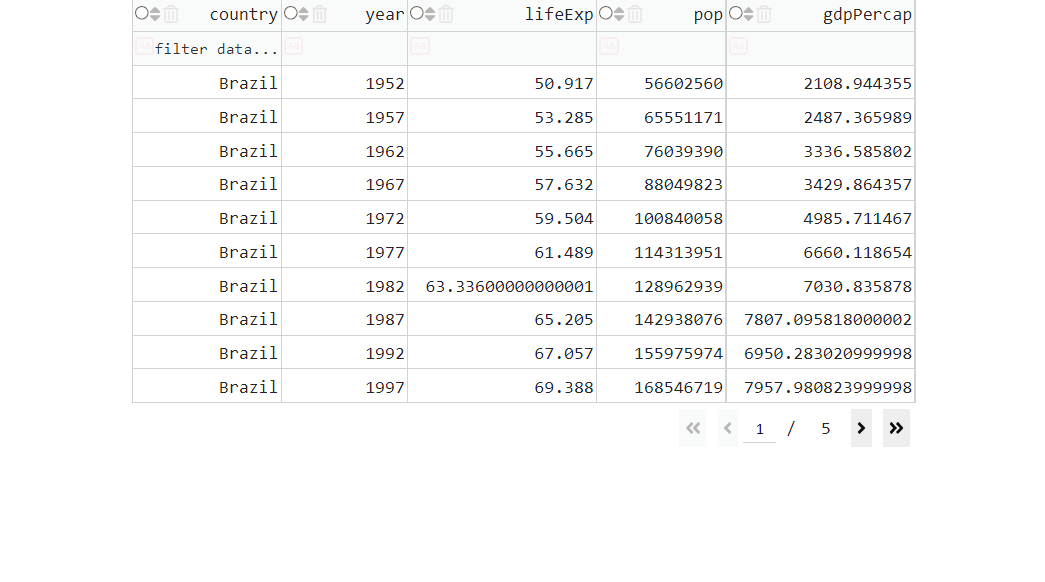
9.3.2 Filtering
We can also add the option to filter the columns of data with the filter_action property.
# Import libraries
from dash import Dash, dash_table, dcc, Input, Output, State
import dash_bootstrap_components as dbc
import pandas as pd
import plotly.express as px


# Import data into Pandas dataframe
df = px.data.gapminder()

# Filter data with a list of countries we're interested in exploring
country_list = ['Canada', 'Brazil', 'Norway', 'Germany']
df = df[df['country'].isin(country_list)]

# Filter columns we want to use
df.drop(['continent', 'iso_alpha', 'iso_num'], axis=1, inplace=True)

# Create a Dash DataTable
data_table = dash_table.DataTable(
        id='dataTable1',
        data=df.to_dict('records'),
        columns=[{'name': i, 'id': i, 'selectable':True} for i in df.columns],
        page_size=10,
        column_selectable="single",
        sort_action='native',
        filter_action='native',
)

# Create the Dash application with Bootstrap CSS stylesheet
app = Dash(__name__, external_stylesheets=[dbc.themes.BOOTSTRAP])

# Create the app layout
app.layout = dbc.Container([
    dbc.Row([
        dbc.Col([
            data_table,
        ]),
    ]),
])


# Launch the app server
if __name__ == '__main__':
    app.run_server()
See Table
In this example we use the filtering operators “>”, “<”, “=”. If you’d like learn more, see the documentation on filtering operators.
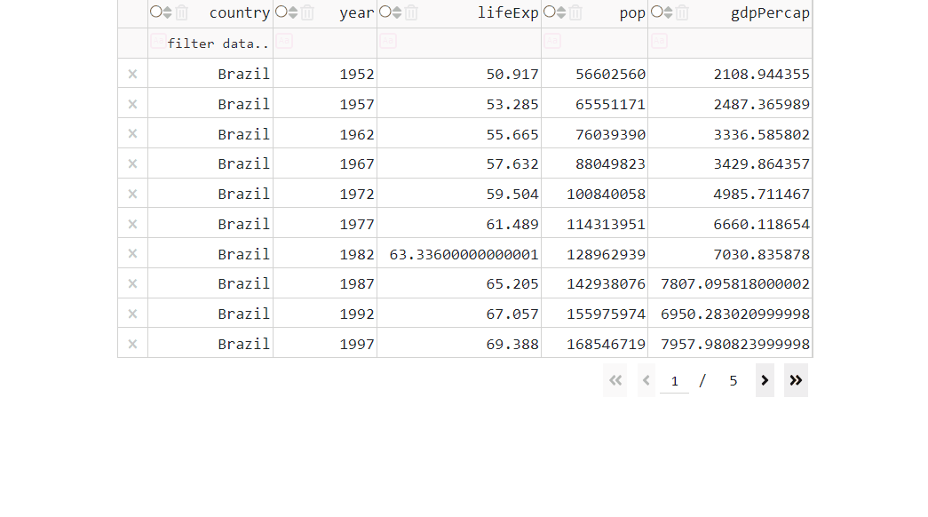
9.3.3 Delete Columns
Datasets will often contain much more data than we care about. Let’s allow the user to delete columns in the DataTable that they are not interested in. To do that, we need to activate the deletable key inside the columns property.
# Import libraries
from dash import Dash, dash_table, dcc, Input, Output, State
import dash_bootstrap_components as dbc
import pandas as pd
import plotly.express as px


# Import data into Pandas dataframe
df = px.data.gapminder()

# Filter data with a list of countries we're interested in exploring
country_list = ['Canada', 'Brazil', 'Norway', 'Germany']
df = df[df['country'].isin(country_list)]

# Filter columns we want to use
df.drop(['continent', 'iso_alpha', 'iso_num'], axis=1, inplace=True)

# Create a Dash DataTable
data_table = dash_table.DataTable(
        id='dataTable1',
        data=df.to_dict('records'),
        columns=[{'name': i, 'id': i, 'selectable':True, 'deletable':True} for i in df.columns],
        page_size=10,
        column_selectable="single",
        sort_action='native',
        filter_action='native',
)


# Create the Dash application with Bootstrap CSS stylesheet
app = Dash(__name__, external_stylesheets=[dbc.themes.BOOTSTRAP])

# Create the app layout
app.layout = dbc.Container([
    dbc.Row([
        dbc.Col([
            data_table,
        ]),
    ]),
])


# Launch the app server
if __name__ == '__main__':
    app.run_server()
See Table
9.3.4 Delete Rows
Sometimes we’d like to remove a datapoint from our plot. Let’s allow the user to delete rows in the DataTable with the row_deletable property:
# Import libraries
from dash import Dash, dash_table, dcc, Input, Output, State
import dash_bootstrap_components as dbc
import pandas as pd
import plotly.express as px


# Import data into Pandas dataframe
df = px.data.gapminder()

# Filter data with a list of countries we're interested in exploring
country_list = ['Canada', 'Brazil', 'Norway', 'Germany']
df = df[df['country'].isin(country_list)]

# Filter columns we want to use
df.drop(['continent', 'iso_alpha', 'iso_num'], axis=1, inplace=True)

# Create a Dash DataTable
data_table = dash_table.DataTable(
        id='dataTable1',
        data=df.to_dict('records'),
        columns=[{'name': i, 'id': i, 'selectable':True, 'deletable':True} for i in df.columns],
        page_size=10,
        column_selectable="single",
        sort_action='native',
        filter_action='native',
        row_deletable=True,

)


# Create the Dash application with Bootstrap CSS stylesheet
app = Dash(__name__, external_stylesheets=[dbc.themes.BOOTSTRAP])

# Create the app layout
app.layout = dbc.Container([
    dbc.Row([
        dbc.Col([
            data_table,
        ]),
    ]),
])


# Launch the app server
if __name__ == '__main__':
    app.run_server()
See Table
Exercises
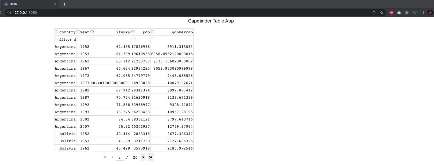
(1) Build an app composed of a title and a table. In terms of layout, the table should be wrapped in a Col component of width = 6 and the table should show the following columns from the Gapminder dataset: country, year, lifeExp, pop, gdpPercap. The dataset should be filtered by 'continent'=='Americas'. The table columns should be selectable, and the native filtering option should be enabled.
See Solution
from dash import Dash, dash_table, dcc
import dash_bootstrap_components as dbc
import pandas as pd
import plotly.express as px

# Import data & perform data-preprocessing
df = px.data.gapminder()
df = df.loc[df['continent']=='Americas', :]
df.drop(['continent','iso_alpha', 'iso_num'], axis=1, inplace=True)

# Create a Dash DataTable
data_table = dash_table.DataTable(
        id='dataTable1',
        data=df.to_dict('records'),
        columns=[{'name': i, 'id': i, 'selectable':True} for i in df.columns],
        page_size=15,
        column_selectable="single",
        filter_action='native'
)

# Create the Dash application
app = Dash(__name__, external_stylesheets=[dbc.themes.BOOTSTRAP])

# Create the app layout
title_ = dcc.Markdown(children='Gapminder Table App', style={'textAlign': 'center','fontSize': 20})

app.layout = dbc.Container([
    dbc.Row([dbc.Col([title_], width=12)]),
    dbc.Row([dbc.Col([data_table], width=6)]),
    ])

# Launch the app server
if __name__ == '__main__':
    app.run_server()
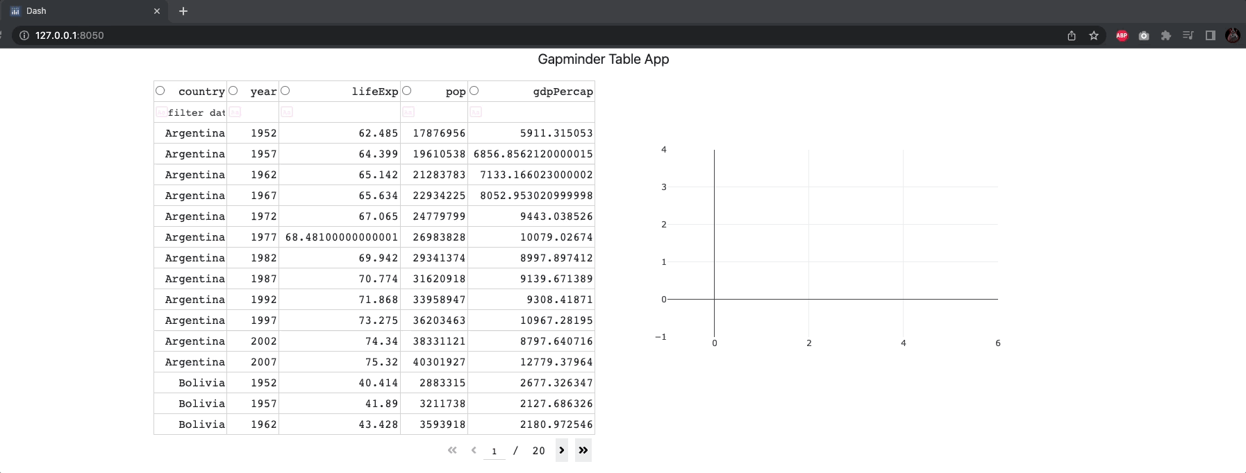
(2) Based on the table created in the above exercise, complete the app with a line chart. The chart should be located in a new column, on the same row next to the table. The linechart should have years on the x-axis, one line per country and should show the selected column on the y-axis.
See Solution
from dash import Dash, dash_table, dcc, Input, Output
import dash_bootstrap_components as dbc
import pandas as pd
import plotly.express as px

# Import data & perform data-preprocessing
df = px.data.gapminder()
df = df.loc[df['continent']=='Americas', :]
df.drop(['continent','iso_alpha', 'iso_num'], axis=1, inplace=True)

# Create a Dash DataTable
data_table = dash_table.DataTable(
        id='dataTable1',
        data=df.to_dict('records'),
        columns=[{'name': i, 'id': i, 'selectable':True} for i in df.columns],
        page_size=15,
        column_selectable="single",
        filter_action='native'
)

# Create the Dash application
app = Dash(__name__, external_stylesheets=[dbc.themes.BOOTSTRAP])

# Create the app layout
title_ = dcc.Markdown(children='Gapminder Table App', style={'textAlign': 'center','fontSize': 20})

app.layout = dbc.Container([
    dbc.Row([dbc.Col([title_], width=12)]),
    dbc.Row([
        dbc.Col([data_table], width=6),
        dbc.Col(dcc.Graph(id='line-chart-1'), width=6)
        ]),
    ])

# Callbacks
@app.callback(
    Output('line-chart-1', 'figure'),
    Input('dataTable1', 'data'),
    Input('dataTable1', 'columns'),
    Input('dataTable1', 'selected_columns'),
    prevent_initial_call=True
)
def display_output(rows, columns, sel_col):
    fig = px.line(df, x='year', y=sel_col[0], color='country', markers=True)
    return fig

# Launch the app server
if __name__ == '__main__':
    app.run_server()
Summary
In this chapter we learned about Dash DataTables. In the next chapter we will learn about advanced callbacks, multiple outputs, and State.